The Journal of Aesthetics and Art Criticism 2017
I now turn to my new question about colour: What is the role of colour in expression? I cannot hope to answer this as a general question. But to try to advance at least some way, I will take up the example of Mark Rothko. Many critics agree that Rothko’s paintings evoke unusually strong emotional responses in viewers and that this is mainly due to their use of colour. In histories of modern art, Rothko is usually classified as a colour field painter, although he himself rejected accounts of his works that focused on formal features. Rothko staunchly defended claims about his works’ expressive aims.
I’m interested only in expressing basic human emotions – tragedy, ecstasy, doom, and so on – and the fact that lots of people break down and cry when confronted with my pictures shows that I communicate those basic human emotions. . . . The people who weep before my pictures are having the same religious experience I had when I painted them. And if you, as you say, are moved only by their colour relationships, then you miss the point! (quoted in Rodman 1957, 94)
Many viewers agree and find Rothko’s paintings unusually potent. Indeed, James Elkins speculates in his wonderfully titled book Pictures and Tears: A History of People Who Have Cried in Front of Paintings that more people have wept before Rothko’s works than those of any other painter (2004, 4). And the colours in the works are central to the viewers’ intense responses. Elkins comments, “From a distance a Rothko painting can be pleasing and even pretty. If you walk up to it, you may find yourself lost in a smear of colors.” He adds: If you step too close to a Rothko, you may find yourself inside it. It is not hard to see why people say they are overwhelmed. Everything conspires to overload the senses: the empty incandescent rectangles of colour, entirely encompassing your field of vision; the sheer glowing silence; the lack of footing, or anything solid, in the world of the canvas; the weird sense that the colour is very far away, yet suffocatingly close. It’s not a pleasant feeling: the painting is all around you, and you feel both threatened and comforted, both cushioned and asphyxiated.
There are few philosophical discussions of how colour operates expressively in Rothko’s paintings. As perceptive a critic as Arthur Danto was sceptical about the kinds of grandiose claims made on behalf of the work by both the artist and his fans. In his essay “Rothko’s Material Beauty,” Danto said that one of the works ”shows what materiality comes to when it does not evoke something deeper than itself” (quoted in Boxer 2000). To him the works were only about beauty. However, some philosophers have found more depth in Rothko’s works. Selma Kraft, writing in 1986, argued as follows:
In 1947 Rothko began to probe a new area of meaning: colour as the source of an indefinitely open, expanding experience in which the boundaries between viewer and viewed, space on canvas and beyond, are obliterated. In his attention to the possibility of lifting the emotional experience of colour beyond something closed and finite, Rothko went beyond the questions explored by such earlier innovators in the meaning of colour as Gauguin, Matisse, and Kandinsky. [His works] made it possible to express a new general kind of meaning. Kraft’s claim that Rothko expresses “a new general kind of meaning” sounds promising. But just what is this meaning?
I am reminded by Kraft’s vagueness of my dissatisfaction with Nelson Goodman’s claims about the intellectual impact of abstract art in Ways of Worldmaking. Goodman argues that time spent with abstract art affects our subsequent experience: “Everything tends to square off into geometric patches or swirl in circles or weave into textural arabesques, to sharpen into black and white or vibrate with new colour consonances and dissonances”. But I am not sure it is the world outside the museum that vibrates with new colour consonances when we leave a Rothko exhibition – it is the paintings themselves that vibrate. Perhaps, too, something about ourselves and our own inner states is transformed.
More help comes from a subsequent article in which Katherine Thomson-Jones took up the challenge of specifying content in abstract art. In her article, “Inseparable Insight: Reconciling Cognitivism and Formalism in Aesthetics,” Thomson- Jones sketched what Kraft may have intended: Rothko’s work is about something, namely, our very own experience of colour. Many minimalist artworks are about something in this sense, precisely because they are minimalist. . . . What is interesting about Kraft’s argument is that she applies the semantic distinction between form and content to a corpus of artworks that is not obviously representational. . . . [T]he semantic distinction can be applied to minimalist art like Rothko’s insofar as such work has meaning that is articulated in a certain way.
It is refreshing to hear such a clear claim that nonrepresentational works can have semantic content. But the content suggested here by Thomson-Jones is still too minimal to account for many viewers’ strong responses to Rothko’s paintings. Abstract works understood this way are about art or about themselves; the colors are about colour. This leaves us a long way from Rothko’s grand themes of ecstasy, fate, and doom. Thomson-Jones does take things further, though, by suggesting that, on certain views of emotions, an artwork that stimulates exploration of our inner emotional lives can have cognitive dimensions that inform us about our lives and ethical views.
Just as the way I respond to a situation establishes its significance for me, so the way an artist presents the subject of his or her work establishes my ability to see new significance in familiar aspects of ethical life. These two ways of learning from art show that the inseparability of form and content in art need not rule out the aesthetic relevance of learning from art. Thomson-Jones’s idea that emotional insight or reflection stimulated by an artwork can inform ethical life is interesting and offers further specification of Goodman’s claims about abstract art. But the challenge about Rothko’s expressive power remains, because Thomson-Jones’s main examples to illustrate how emotional experience can lead to ethical insight are from works by authors like Charles Dickens and Toni Morrison. It is easier to see in such literary cases how processes of identification, empathy, and moral assessment are facilitated by readers’ emotional responses.
Recall Rothko’s claim that his paintings are about basic human emotions and that if audiences respond, then they feel what he was feeling while painting them. This reflects a theory of expression sometimes called the contagion view, which treats art as an expression of the artist’s own emotions, a view presented by Tolstoy (1996) in What Is Art? On this view, expression works in a direct way: the artist has a feeling, somehow puts it into the work, and it is transferred to the audience. This view has many critics. A prominent alternative is Peter Kivy’s account of expression in music, developed in The Corded Shell (Kivy 1980). Kivy speaks of an artwork as expressive of emotion rather than expressing it. Aspects of music are expressive due to their resemblance to familiar cases of human expressiveness. As an example of this “contour theory,” Kivy mentions how a Saint Bernard’s face can be expressive of sadness without the dog itself being sad. A major challenge for the art critic attempting to account for expressiveness in Rothko’s mature works is their simplicity. This is particularly true of the very large and dark coloured canvases in the Houston chapel that bears his name. Elkins cites remarks from the Rothko Chapel visitors’ book saying things like “I felt crushed,” “I was moved to tears,” and “It is a visually and viscerally stunning experience”.
Basically, the contour theory posits recognition of some observable similarity to human expression of emotion. Trying to apply the contour theory to the Rothko Chapel murals, we might draw comparisons between their dark colors and people’s dark moods or dark faces.13 Generally, faces are termed “dark” when they are angry (angry people’s faces tend to become more red), and moods are dark when someone is depressed. But such comparisons seem superficial. It is too easy to draw links between the dark colors of the Rothko Chapel canvases and facts we know about the artist’s depression and eventual suicide.
Talk of the “dark” paintings seems not so much to involve visual similarities as using “dark” metaphorically. Elkins surely uses the term in a metaphorical way when he says, “I think Rothko was trying to learn how to live with pure unrelieved darkness”. The contour theory fails to recognise that the murals were designed for a (nondenominational) chapel-that is, for a religious setting. In addition, the paintings in situ change appearance in surprising ways due to the skylight overhead that allows for shifting natural light. Or, at evening events, the works take on yet another appearance when lit by flickering candelabra.
Perhaps the paintings are dark in order to convey mystery and stimulate meditation in a cave-like atmosphere. For some viewers this experience is fruitful; for others, off-putting. The latter was Elkins’s reaction. After a few days of studying the murals and how visitors react to them, he writes: The paintings are like black holes, absorbing every glint of light, sopping up every thought. Wherever you turn, they face you, and show you nothing but blackness. They say nothing and depict nothing: they just bear down. I had felt some of that the day before, and I had started taking notes partly to avoid thinking about it. Other people just close their eyes and meditate, released from Rothko’s weird unhappiness into their own more pleasant thoughts.
The Rothko Chapel murals are atypical in the artist’s oeuvre in using very dark shades of black, blue, and purple. I would like to move toward understanding how other examples of Rothko’s paintings express emotions. Suppose that we pursue the ideas from Kraft and Thomson-Jones that Rothko’s paintings are about our own experiences of colour and that these experiences lend themselves to acts of emotional appraisal that can inform our lives. Here we can benefit from the theory of expression developed by Jenefer Robinson (2005) in her book Deeper than Reason. Robinson offers a careful defence of the idea that emotions are types of “affective appraisals” of the world. Her account of expression, the “new Romantic theory,” is a revised version of the position articulated by R. G. Collingwood, who held that artists work out their ideas and emotions in forms suitable for embodying them.
In its primary sense expression is something intentionally brought about by an artist that consists, roughly speaking, in the manifestation and elucidation of an emotional state of a persona in the expressive character of a poem, a painting, a piece of music, etc., such that the work provides evidence for the emotional state of the persona and the persona’s emotional state is communicated to other people . . . through the character of the work.On Robinson’s account, an artwork gives evidence that a persona in the work has experienced an emotion. The emotion is intentionally put in the work and in turn perceived by the audience; in this process the artist and audience both become clearer about the emotion.
Robinson outlines how her account can be applied to examples of expression in various artistic genres ranging from music to literature and painting. She writes, for example, that some musical works “should indeed be experienced as containing a persona whose unfolding emotional life is portrayed in the music”. The case is similar for painting. Here Robinson writes: Representational paintings can also express emotions in a double way. On the one hand a painting can convey a point of view by presenting a vision of the world as seen from the viewpoint of a person in the throes of a particular emotion. On the other hand, a picture can also convey something of what it is like for a person to view the world in that way: it can show the person him- self or herself and how the emotion affects him or her. As examples, Robinson discusses various representational works by Friedrich, Delacroix, Munch, and Kirchner. Stylistic features such as “violent brushwork and lurid colours” can express a painter’s attitude, “or that of his artistic persona” (2005, 276). What about nonrepresentational works? Despite not depicting characters, Robinson argues, abstract works can also manifest expressive actions – as for example with Pollock’s drip paintings. We can see the actions constituting these works, and such paintings might express emotions in a way comparable to how dance does, by enacting gestures or behaviours of someone manifesting an emotional state.
Robinson’s “new Romantic theory” of expression offers a promising avenue for de- scribing Rothko’s use of colour. Remember that we can recognize intended expressive aims in works without necessarily experiencing the emotions that are expressed. This way of putting things helps fill out missing details of Thomson- Jones’s idea that even abstract art can provide illumination about our emotional and moral life. It is more accurate to say that people who are moved by Rothko’s paintings are moved by seeing the world in a new way or realising something about emotional life than to insist on a direct transmission of feelings, as Rothko did (along the lines defended by Tolstoy).
We see and understand the emotional expressiveness of Rothko’s works because of very specific ways in which the stylistic components (especially colors) function in his mature paintings. Bianca Bromberger offers some help on this: “His paintings, he believed, were ‘dramas’ and the presences of light in the pictures were ‘performers.’ These shapes ‘have no direct association with any particular visible experience, but in them one recognizes the principle and passion of organisms'” (2008, 12-13, citing Rothko 2004, 33 and 35). Rothko himself gave reasons for viewing his central shapes as playing the role he claimed form them, as the counterpart of figures or organisms. He felt a very strong need to eliminate the human figure in his works. He wrote, ‘I belong to a generation that was preoccupied with the human figure and I studied it. It was with most reluctance that I found that it did not meet my needs. Whoever used it mutilated it. No one could paint the figure as it was and feel that he could produce something that could express the world. I refuse to mutilate and had to find another way of expression. (Rothko, quoted in Greene 2015, 168)
Of course, we do not have to take Rothko at his word about how elements of his paintings work. We could dismiss his claims as grandiose, as Danto apparently did. But I think it is fruitful to consider relationships between the central blocks of colour in Rothko’s paintings as dynamic and therefore gestural. The simple looking rectangles of colour of the mature canvases function like dramatic figures engaged in intricate relationships. The shapes and their interactions can be regarded as personas that manifest emotions; they are stand-ins for the personas Robinson wrote about in representational works, showing us how it feels to be in the throes of certain emotions, or how the world looks to someone with those emotions. To begin filling this out, let me cite a descriptive analysis of one of Rothko’s works. This is from the Phillips Collection (2017) website concerning the painting Ochre and Red on Red.
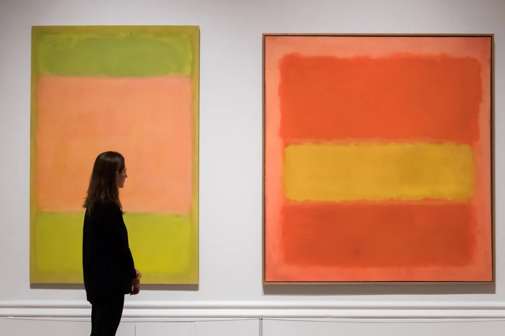
In Ochre and Red on Red a buoyant effect is created by the blazing yellow square, which, in comparison to the darker red of its surroundings, appears to surge out of the composition into the viewer’s space. Ochre and Red on Red becomes an example of Rothko’s highly emotional works with its high-keyed pigments and vibrant colours. This analysis makes a good start at identifying the expressive components (“personas”) of Ochre and Red on Red. The features cited here are of the right sort. They involve specific facts about this work with expressive potential: its yellow square and its red background and how they are related. These parts are characterised by use of terms like “blazing” and “high-keyed”; the yellow square is “surging out of the composition.”
Taking this lead, we can identify numerous factors in Rothko’s paintings that make their coloured sections – rectangles, backgrounds, and edges – function expressively. Because of the paintings’ scale, their surface treatment, choices of pigment and its application, and colour relationships, they do appear to manifest expressive actions and attitudes. It is important to remember the works’ size. Rothko’s mature canvases (1950- 1958) are typically quite large, as large as six by nine feet. When viewed from close up, Rothko recommended a distance of just 18 inches, the paintings envelop our visual field.18 (This enveloping strategy will become even more salient, as we shall see, in the light installations of Turrell and Eliasson.) Rothko wanted the works to be hung at eye level and with indirect, even dim, lighting. He typically painted over the edge of the canvas. These factors work to heighten the envelopment effect and to bring the simple components of the paintings to our attention.
In Rothko’s signature works these components are two unequally sized rectangular shapes with indefinite edges that appear to float against a different coloured background. He employed various techniques to apply the paint, including staining, so it is rare to see evidence of brush strokes, though one can discern streaks, patches, feathering, and under-layers. The colours are distinctive and saturated, but not uniform. Standing eye to canvas we can notice textures and subtle differentiations in colour along with individual quirks such as a block’s blurred edges. The dynamism of the forces at work results from specific aspects of the composition, including hue and saturation, intensity, and edge treatment. We should also notice the selection of backgrounds and the thin lines of border colours that are sometimes interposed between the two central masses.
Especially when a viewer stands very close, the large vague shapes of these paintings, with their indefinite boundaries, seem to move; critics comment that the shapes appear to pulse from within. Sometimes the material substance of the picture seems to be either receding or pushing outward. (Remember the remark above about how yellow of Ochre and Red on Red “seems to surge out . . . into the viewer’s space.”) Within their typically vertical format, due to the uneven size of the rectangles, it can look as if the shapes are not in balance: either one is erupting upward or one is pressing the other down. Elkins comments in a similar vein about one of the Rothko Chapel paintings that “the black rectangle is up at the top as if it has floated there against the law of gravity”. The active interaction of the shapes is akin to the gestural interaction of dancers.
