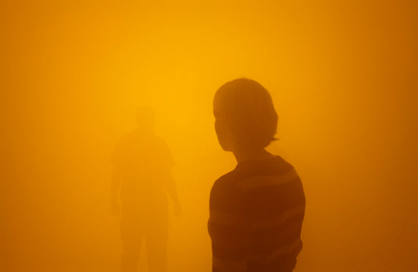
From Star Wars: Episode III—Revenge of the Sith (2005), directed by George Lucas. Courtesy of Lucasfilm, Ltd., San Francisco, California, United States. (Illustration Credit 29.1)
Who is the greatest artist of our time? Normally, we would look to literature and the fine arts to make that judgment. But Pop Art’s happy marriage to commercial mass media marked the end of an era. The supreme artists of the half century following Jackson Pollock were not painters but innovators who had embraced technology—such as film director Ingmar Bergman and singer-songwriter Bob Dylan. During the decades bridging the twentieth and twenty-first centuries, as the fine arts steadily shrank in visibility and importance, only one cultural figure had the pioneering boldness and world impact that we associate with the early masters of avant-garde modernism: George Lucas, an epic filmmaker who turned dazzling new technology into an expressive personal genre.
The digital revolution was the latest phase in the rapid transformation of modern communications, a process that began with the invention of the camera and typewriter and the debut of mass-market newspapers and would produce the telegraph, telephone, motion pictures, phonograph, radio, television, desktop computer, and Internet. Except for Futurists and Surrealists, the art world was initially hostile or indifferent to this massive surge in popular culture. Industrial design, however, rooted in De Stijl and the Bauhaus, embraced mechanization and grew in sophistication and influence until it has now eclipsed the fine arts.
No one has closed the gap between art and technology more successfully than George Lucas. In his epochal six-film Star Wars saga, he fused ancient hero legends from East and West with futuristic science fiction and created characters who have entered the dream lives of millions. He constructed a vast, original, self-referential mythology like that of James Macpherson’s pseudo-Celtic Ossian poems, which swept Europe in the late eighteenth century, or the Angria and Gondal story cycle spun by the Brontë children in their isolation in the Yorkshire moors. Lucas was a digital visionary who prophesied and helped shape a host of advances, such as computer-generated imagery; computerized film editing, sound mixing, and virtual set design; high-definition cinematography; fiber-optic transmission of dailies; digital movie duplication and distribution; theater and home-entertainment stereo surround sound; and refinements in video-game graphics, interactivity, and music.
Lucas was born and raised in the small town of Modesto in the flat farmland of the San Joaquin valley in Northern California. His father was an exacting owner of an office-supply store who expected his only son to inherit the family business. Small, shy, and socially maladroit, Lucas was a daydreamer who had trouble reading and writing at school and who gravitated toward mechanics and the visual arts, in which he showed early talent. “I was more picture-oriented,” he said. He liked woodworking, tinkering, and taking photos, mostly of objects rather than people. He sculpted and did watercolors and ink drawings of landscapes and sports cars, some of which he sold. Comic books were a passion: he collected so many that his father built a shed for them; Lucas later called them his primary model for terse visual narrative. At the movies, he liked vintage Westerns and pirate swashbucklers, then declining genres; on TV, he never missed the old Flash Gordon serial, broadcast nightly. In his teens, cars as high-powered, girl-attracting status symbols were “all-consuming” to him. He entered races and won trophies at speedways around California. He already viewed hot rods (brightly painted customized cars with souped-up engines) as populist works of art—a theme he would recast in Star Wars’ ingenious spacecraft and sleek land speeders, which are steered casually and repaired impromptu like cars.
Intrigued by TV commercials, with their febrile graphics, Lucas decided to become a commercial illustrator, but his father overruled it and refused to pay for art school. In college in Northern California, Lucas became interested in books for the first time; he read science fiction and dystopian classics by Jules Verne, Aldous Huxley, and George Orwell. Discovering European art films, he was attracted by Jean-Luc Godard’s cinema verité technique and witty, jumpy editing. After transferring to the University of Southern California to study art and still photography, Lucas was bitten by the filmmaking bug, with documentaries his first focus. He said, “I started out as a cameraman and then became fascinated by editing”—a form of collage. He described his student films as “abstract visual tone poems,” with special attention paid to sound design. His fast edits impressed another Los Angeles film student, future director Steven Spielberg.
Lucas’s first feature film, THX 1138 (1971), shot in San Francisco and produced by his new friend Francis Ford Coppola, adapted his own story from a student film. It portrays a totalitarian future world of mind and body control where drugs are compulsory and sex is banned. Despite a sometimes clinical bleakness, its deft shuffle of cool, luminous images (edited by Lucas) often resembles minimalist scenarios of avant-garde dance, then flourishing in San Francisco. The film unexpectedly ends in a car chase, as a magnificent Lola T70 racer speeds through city tunnels, its supercharged whine a piercing machine music injected by Lucas into Lalo Schifrin’s moody, ambient score.

But cerebral, European-style angst had narrow audience appeal. Lucas now turned to American youth culture: his low-budget American Graffiti (1973), with its high-school sock hop, hamburger drive-in, and drag racing, re-created his Modesto youth. It was a surprise box-office smash; its soundtrack album of Top 40 hits also made a fortune, rescuing Lucas and his wife from crippling debt. The film spawned a national nostalgia craze for the 1950s, as in the TV series Happy Days. Lucas wanted to film Flash Gordon next, but the rights had already been bought by Dino De Laurentiis for Federico Fellini, who never did the movie. Despite his aversion to writing, Lucas began painstakingly composing his own science-fiction story: it centered on the adventures of two bickering robots (the future R2-D2 and C-3PO), inspired by the comedy duo Laurel and Hardy as well as the clownish hobo peasants of Akira Kurosawa’s Hidden Fortress. Science fiction, once a B-movie staple with ramshackle special effects for teenagers, was currently marginalized except on TV, where Star Trek had acquired a devoted fan base. Stanley Kubrick’s majestic 2001: A Space Odyssey had made an international sensation in 1968, but it took seven years to earn a profit. Thus no one, including Lucas, had high expectations for his project about “a long time ago in a galaxy far, far away” (Star Wars’ opening crawl, a phrase from Lucas’s earliest drafts).
The proposal for Star Wars was rejected by Universal Studios before finally being accepted by a skeptical 20th Century Fox. Star Wars “might never have been made,” Lucas acknowledged, without Ralph McQuarrie’s concept paintings, based on Lucas’s instructions: the first picture showed the two robots against a desert landscape on a distant planet. To make Star Wars as he envisioned it, however, Lucas had to invent a whole new technology. In 1975, he founded his own laboratory, as feudal as a medieval guild: Industrial Light & Magic (ILM), a subdivision of Lucasfilm hidden in an old warehouse in an industrial park outside Los Angeles. The young computer whizzes hired by Lucas’s special-effects supervisor, John Dykstra, looked like hippies and brainstormed in the chaotic atmosphere of a commune. Out of ILM, which later moved north to Marin County, would come such wonders as the nimble, stampeding dinosaurs of Jurassic Park and the morphing, liquid-chrome killer robot in Terminator 2. ILM’s Pixar Image Computer facilitated 3-D medical imaging and produced (after sale to Apple’s Steve Jobs) the first digitally animated feature film, Toy Story.
Before writing the Star Wars screenplay, Lucas read extensively—fairy tales, mythology, and anthropology, including Frazer’s The Golden Bough, Joseph Campbell’s Hero with a Thousand Faces, and Carlos Castaneda’s The Teachings of Don Juan. The robots receded while archetypal patterns emerged—mysterious births, quests for identity, father-son conflicts, rites of passage. Lucas calls much of his script “very personal”: “There’s more of me in Star Wars than I care to admit.” His hero’s name, Luke Skywalker, blatantly echoes his own. Lucas said that the Germanic name of the ruthless Darth Vader, Luke’s shadowy father and antagonist, was “a combination Death Water and Dark Father.” Chief enforcer of the Nazi-like evil Empire, Vader is the target for what Lucas calls his own “basic dislike of authority figures,” rooted in childhood and surfacing in his skirmishes with Hollywood studios and unions.
The explosive action of Star Wars, which at its release in 1977 electrified a global audience starved for adventure movies, began as a vision of dance in Lucas’s mind: “I wanted to see this incredible aerial ballet in outer space.” He had used dance metaphors before: in the story treatment for American Graffiti, he wrote: “The dancing is created by cars performing a Fifties ritual called Cruising.… The passing chrome-flashing cars become a visual choreography.” Before this, space battles had been stodgy encounters of behemoths zapping each other with lasers. Lucas gathered samples of zigzagging dogfights from World War II movies to give to his design staff. Special equipment had to be built. The computerized, motion-control Dykstraflex camera, based on factory production-line automated spray painting, swiveled, tracked, and panned around a stationary model: the darting spaceships of Star Wars never actually moved. Lucas’s spectacular aerial battles, which became increasingly complex with each film, must be regarded as significant works of modern kinetic art whose ancestry is in Marcel Duchamp’s readymades and Alexander Calder’s mobiles. The exhilarating eight-minute battle over Coruscant that opens Revenge of the Sith (2005), with its dense cloud of stately destroyers, swooping starfighters, and fiendish buzz droids, cuts optical pathways that are as graceful and abstract as the weightless skeins in a drip painting by Jackson Pollock. An ILM technician calls Lucas a “great master-weaver,” guiding and gathering the fine stitching of his army of gifted fabricators.
Because of their enormously lucrative summer blockbusters, including their joint Indiana Jones series, both Lucas and Spielberg were accused of infantilizing the industry and driving out adult, character-driven films. They were punished at the Academy Awards, where for many years they were given Oscars only for technical achievement. But the first Star Wars movie was far more experimental than initially perceived. Lucas’s novel methods baffled Fox executives and alienated the British crew at Elstree Studios, who assumed the film would be a flop. Lucas used two and sometimes three or four cameras: encouraging improvisation (there were no rehearsals), he reserved his options for postproduction. He called for naturalistic acting to anchor the space fantasy. He started in close, avoiding establishing shots; long shots were never held. He wanted a nostalgic “filtered look” but kept changing key lights for a “flashing, strobing” effect. He used a loose, “nervous” frame, as in newsreels. The dramatic center was displaced, deflecting the eye to background activity, which in later films would include poetically changing weather. This first film gradually turned darker, following a symbolic color scheme where organic brown and warm gold yielded to high-tech black, white, and steely gray.
For emotional resonance, Lucas commissioned a romantic 1930s Hollywood orchestral score from composer John Williams, who created a haunting constellation of operatic leitmotifs. For sound design, Lucas wanted real noises, not synthesized science-fiction twitters. Thus Star Wars’ spacecraft doors open and sandcrawlers rumble with whooshes and clatter from the Philadelphia subway, recorded by soundman Ben Burtt. Burtt’s very first sound effect for Star Wars was the hypnotic drone of the lightsaber, created by layering a TV-tube buzz over a projector-motor hum. Lucas’s most avant-garde and much-imitated production concept was that of a rusty, junk-strewn “used universe.” Costumes, weapons, vehicles, and sets were distressed for realism: robots and body armor were nicked and scuffed, walls smudged, and actors told to roll in the dirt.
Criticism of the Star Wars series has centered on its limited female roles and avoidance of sex; its paucity of black actors and its caricatured accents perceived as racist; and its sometimes wooden dialogue. Lucas says, “My films are basically in the graphics”: “Everything is visual.” He views dialogue as merely “a sound effect, a rhythm, a vocal chorus in the overall soundtrack.” In structure, Star Wars unfolds as dynamic action sequences alternating with grand panoramic tableaux, including breathtaking cityscapes stacked with traffic skylanes. Lucas declares, “I’m not really interested in plots.” And elsewhere: “To me, the script is just a sketchbook, just a list of notes.” Plot details (like the origin of a facial scar) are sometimes supplied from outside the films in the gargantuan cosmos of Star Wars serial cartoons, video games, novels, handbooks, action figures, plastic kits, and Web sites. Lucas’s pictorial orientation as a director is unmistakable in his mission statement: “Movies are a mass of objects moving across a large surface.” His main task, he says, is to decide where the viewer’s eye should be and for how long. Lucas calls digital technology “a new color”: “It’s a whole different way of making movies. It’s painting now; it’s not photography anymore.”
Lucas’s massive product licensing and merchandising tie-ins, which he presciently negotiated with studio executives who saw little future in them, made him a billionaire, but his phenomenal success as a shrewd businessman has certainly slowed his recognition as a major artist. What has not been appreciated is the enormous contribution made by Lucasfilm to the visual education of children around the world. For example, its series of Incredible Cross-Sections books (subtitled The Definitive Guide to the Craft of “Star Wars”) is packed with stunning works of conceptual art: richly detailed diagrams and cutaways, including four-page foldouts, of imaginary spacecraft, weaponry, and alien species. The precise draftsmanship, mastery of perspective, and glorification of engineering in these superbly produced books have not been seen since modernist abstraction swept away the great tradition of architectural drawings of the neoclassic Beaux Arts school. In genre, the Cross-Sections books are anatomies, analogous to Leonardo da Vinci’s notebooks, with their medical dissections, botanical studies, and military designs for artillery, catapults, tanks, and then-impossible submarines and flying machines.
While plot and dialogue may be de-emphasized, a simple yet cohesive philosophical system permeates all six films of Star Wars. Lucas’s youthful liberalism (versus his father’s rock-ribbed conservatism) was typical of the bohemian San Francisco Bay Area, a 1960s hotbed of radical politics and psychedelia. But Lucas is a straight arrow who does not smoke, drink, or use drugs and who had to curb even his chocolate habit because of diabetes. Except for his custom-built rural enclaves in Marin County (he calls himself a “frustrated architect”), he lives frugally, plowing his profits back into film development. Environmentalism is implicit in Star Wars’ lavish array of planetary ecosystems, fertile or ravaged; the color green always signifies good, as in the lizard-like skin of the ancient guru Yoda. Lucas professes a multicultural interest in world religions, with their diverse conceptions of God and spirit, and calls himself a “Buddhist Methodist.” Divine power in Star Wars is the Force, an energy field around objects and living beings. As in 1960s occultism, gifted individuals, like the Jedi Knights with their samurai warrior code (Bushido), have a mystic power of telepathy and telekinesis. In its preoccupation with good and evil (“the dark side”), Star Wars often resembles 1950s Bible movie spectacles. Indeed, a poster of Cecil B. DeMille’s The Ten Commandments hung in the main office of ILM, which rescued and retrofitted DeMille’s wide-screen VistaVision cameras for Star Wars. Finally, Star Wars takes a cyclic view of history, seeing democracy defeated again and again by fascism and imperialism, from Caesar to Napoleon and Hitler.
Lucas’s stature as an artist, as well as his relentlessness as an admitted “micromanager,” is demonstrated by the tremendous climax of Revenge of the Sith, which he directed. The last of the six episodes filmed, this prequel takes the saga to its midpoint. Sith ends with the birth of the twins Luke and Leia, nineteen years before they appear as young adults in the original Star Wars movie. Crosscut with the babies’ birth, during which their mother dies, is the tortured, cybernetic birth of Darth Vader, like Frankenstein’s monster in his laboratory, now attended by pitiless surgical droids. Finally, after nearly thirty years, the mystery of Vader’s origins as the mutilated and reconstructed Anakin Skywalker was revealed to the audience who had made him a legend.
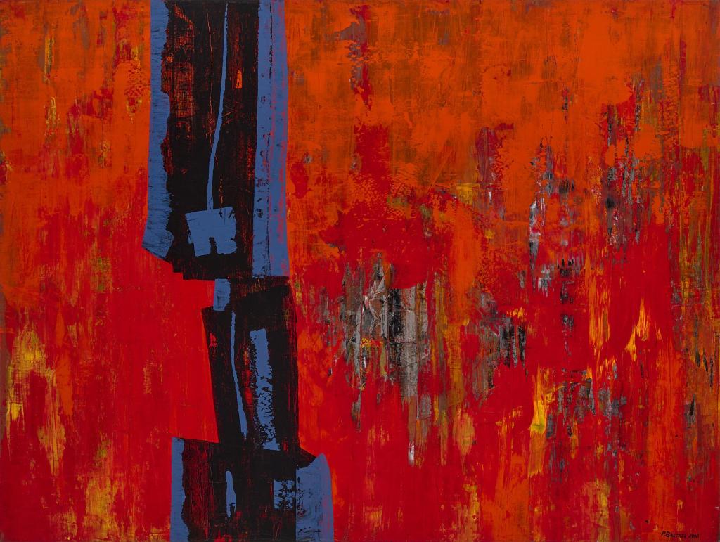
Leading up to the interwoven birth scenes is one of the longest duels ever filmed, set against the apocalyptic backdrop of the sulfurous volcano planet of Mustafar. Lucas called this fierce fight between Anakin Skywalker and his Jedi master Obi-Wan Kenobi “the turning point of the whole series.” Fire provides a sublime elemental poetry here, as water did on the storm-swept planet of Kamino in the prior film, Attack of the Clones. Lucas said he had long had a mental color image of the Sith finale, “monochromatic in its red and blackness.” The seething reds and yellows of the great lava river and waterfalls (based on Niagara Falls) flood the eye. It is a vision of hell. As in Dante, there is an allegorical level: “I have the high ground,” declares Obi-Wan when he springs to the top of a black sandy slope. Hell, as in Marlowe, Milton, and Blake, is a psychological state—Anakin’s self-destructive surrender to possessive love and jealous hate.
Production of the Mustafar episode, which has three hundred special effects, combined cutting-edge, high-definition digital cameras, lenses, and editing techniques with old-fashioned artisanal model making. The phenomenally athletic lightsaber duel was shot against a green screen in Australia a year before the background was filled in at ILM
headquarters in California. Computer animation of lava plumes and sprays and falling hot ash was amplified by real-life volcano footage when Mount Etna suddenly erupted in Sicily: Lucas immediately sent a crew to film it. A miniature set (at 1⁄132 scale) of Mustafar’s craggy black landscape was carved out of foam on a massive platform, which was raised so that the forty-foot-long lava river (composed of fifteen thousand gallons of the translucent food additive methylcellulose, tinted bright yellow) could be under-lighted to glow fiery red and burnt orange. Then the entire platform was tilted so that the river, recycled by a pump system, would flow. Clumps of ground cork simulated floating lava crust, while real smoke was fanned overhead. The result was a collaborative triumph of modern installation art.
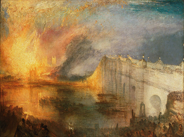
The Mustafar duel, which took months of rehearsal, with fencing and saber drills conducted by sword master Nick Gillard, was executed by Hayden Christensen and Ewan McGregor at lightning speed. It is virtuosic dance theater, a taut pas de deux between battling brothers, convulsed by attraction and repulsion. Their thrusts, parries, and slashes are like passages of aggressive speech. It is one of the most passionate scenes ever filmed between two men, with McGregor close to weeping. The personal drama is staged against a physical one: wrangling and wrestling, Anakin and Obi-Wan fall against the control panels of a vast mineral-collection plant, which now starts to malfunction and fall to pieces. As the two men run and leap for their lives, girders, catwalks, and towers melt and collapse into the lava, demonstrating the fragility of civilization confronted with nature’s brute primal power. Lucas crosscuts to the delirious destruction on Coruscant of the Great Rotunda of the Galactic Senate, with its thousand round balconies in cool tonalities of gray and black. This twinned ruination of industrial and political architecture is an epic Romantic spectacle, like split parts of J. M. W. Turner’s eyewitness painting of the catastrophic burning of the British Houses of Parliament in 1834 (Cleveland Museum of Art). Williams’s thunderous choral score, recorded with the London Symphony Orchestra at Abbey Road Studios, has the implacable charge of a Black Mass. The sound mix, overseen by Lucas, is unnerving: a tempest of roars, hisses, sputters, clangs, and splashes goes shockingly blank and silent when Anakin’s arm and legs are severed midair. He falls heavily to the ground, where he crawls like a serpent with demonic yellow eyes before he catches fire and is half-incinerated.
extract from GLITTERING IMAGE by Camille Paglia 2012