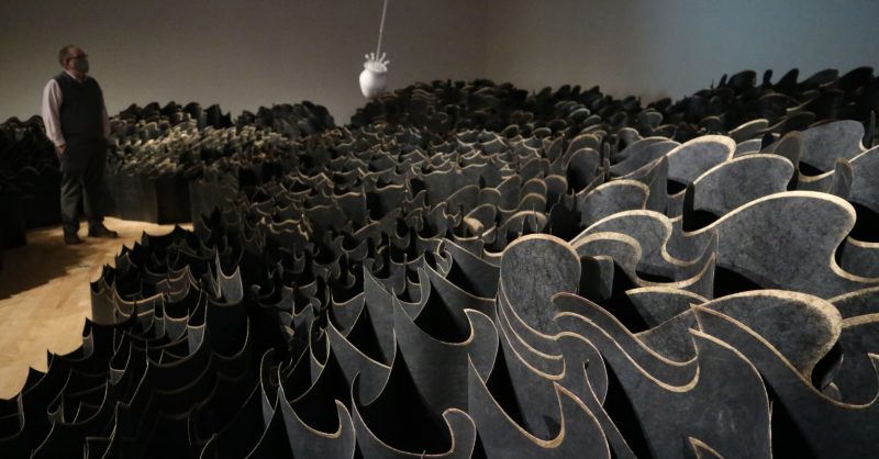
Jennifer Wen Ma (b. 1973) is a multidisciplinary artist whose practice includes installation, drawing, video, public art, design, performance, and theatre. She frequently creates site-specific works that respond to the institutional or community contexts in which they are viewed. Born in Beijing, China, she immigrated to the U.S. in 1986. She has exhibited worldwide and was a member of the creative team for the 2008 Beijing Olympic Opening and Closing Ceremonies.
foward essay by Cynthia Freeland
I must mention a caveat about drawing on re- sources of colour science and psychology to understand expression in art. Colour science attempts to give universal explanations of how vision works, based on studies of human color vision. But people vary, and cultural factors also affect emotional responses to colours. Results of studies of colour in relation to cultural influences are inconclusive (Hardin 1988; Whitfield and Wiltshire, 1990). Let me supply a brief, but I hope interesting, example of an artwork from China for purposes of illustration.
In July 2013 the Chinese American artist Jennifer Wen Ma collaborated with computer expert Zheng Jianwei on a light installation project in Beijing titled Nature and Man in Rhapsody of Light at the Water Cube. The skin of the enormous Water Cube, an aquatic centre built for the 2008 Olympics, was illuminated by an LED display directed by a computer program. The cube displayed varying colours in diverse patterns, brightness, and rhythms to reflect the results of a daily analysis of emotional states. This in turn was generated from two factors: (1) readings and daily summaries from the I Ching (the “Nature” part of the work), and (2) analyses of the emotional expressions (the “Man” part) of participants on the Chinese social media website Weibo (a Twitter equivalent). Wen Ma commented, “We hope that the daily expressions of the Water Cube will convey the current mental state of the Chinese people, as well as reflect upon the traditional view that China holds of the world” (quoted in Zhao 2013).
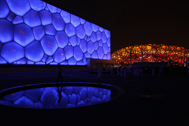
One fundamental background colour was used in each daily display, based upon a selection from among the eight natural elements of the I Ching, interpreted by a relevant expert. Then other display factors were calculated based on analysis of 75 different emoticons gleaned from Weibo. The speed of changes on the display was coordinated with overall moods; sadness was linked to slow movements and happiness to fast ones, and so on. The result was an animated surface on the exterior “skin” of the Water Cube.
Obviously, colour is not the sole expressive element of this installation, but it is one element, and an important one. Some of the colour links chosen to coordinate with the I Ching elements would seem natural to Westerners: the Fire theme was red and the Water theme blue. However, other colour choices seem odd, perhaps because for many non-Chinese people there simply are no relevant associations at work. Thus, the Earth theme was yellow, the Thunder theme involved certain greens, and Heaven was signalled by a sort of pinky-purple-beige colour. My point in mentioning this example is to highlight the fact that cultural factors can affect viewers’ emotional responses to colour in abstract works of art. Even though Western viewers could no doubt appreciate much about the design and appearance of Rhapsody of Light, many probably lack the traditional Chinese cultural associations with the I Ching that would enrich responses to the piece.
My discussion of Jennifer Wen Ma’s work has introduced an example of light installation art. I now turn to a more detailed consideration of how colour functions expressively in other such installation works by James Turrell and Olafur Eliasson. Here, colour no longer involves pigments, since the medium is light itself.26 This changes the terms of the analysis. We must move beyond talk of how painters use pigments to questions about the nature of light and visual perceptions. Typically Turrell and Eliasson do not employ coloured light to represent anything. They do see themselves, however, as continuing and expanding the lengthy tradition of artistic explorations of colour in painting. They also each use coloured light in ways that are emotionally expressive, as I will illustrate; but the explanation of how will prove to be complex.
As it turns out, each man has commented explicitly on the fact that they found inspiration in a painter’s work. Turrell explains that his work was stimulated by the example of how Monet worked with pigment in the well-known serial paintings he did of Rouen Cathedral and of haystacks in different seasons and times of day. Turrell remarks: Monet started painting the cathedrals [of Rouen]. You see the light and the light aspect on things, but with the haystack paintings he begins to take out the haystack. You forget the haystack but not the light, and this was interesting to me. . . . The Impressionists really did this in a manner so that you’re really just looking at light, and that’s the depiction of light in painting.
I guess I was very American about it-like space is colour going to the moon as opposed to exploring how you are in space already, here-I didn’t understand why we didn’t just use light instead of painting light. Turrell managed to create “objects” made of light in some of his early Projection Works of the 1960s and 1970s. These involved bright light projections in a corner of a room otherwise illuminated with a deep colour light. They induce belief in the viewer that there is a solid shape hovering in that corner in the form of a cube or pyramid. Like Turrell, Eliasson has also cited the influence of an earlier artist, in his case Turner, who was devoted to the study of light and colour. In 2014 Eliasson created seven unusual new works, the Turner Colour Experiment Paintings, as both commentary and counterpoint to a major Turner exhibit at the Tate Modern in London. Eliasson commented: For Turner, colour was never an autonomous phenomenon or an aesthetic end in itself-he used it to create ephemeral effects and to leave traditional depiction behind. The paintings are almost abstractions, and I remember my reaction when I first encountered Turner in an art history book as a child: I thought, “Wow, what is such an abstract painting doing here before all these more conventional, realistic paintings?” (Eliasson, quoted in Almino 2015)
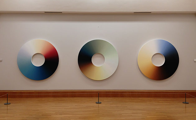
The Colour Experiment Paintings are large, disk- shaped works, each digitally generated after detailed analysis of the colours in specific paintings by Turner. Eliasson said he was fascinated by Turner because of his “distinct emotional ability to shape and frame light.” He made the paintings in a disk format because “the circular shape . . . generates a feeling of endlessness and allows viewers to take in the artworks in a decentralised, meandering way” (quoted in Almino 2015). But the circles of these paintings are surely also a nod to the tradition of the colour wheel. Eliasson has devoted considerable attention to studying colours, with the aim of identifying the exact colours of “each nanometer” of the visible spectrum (quoted in Alderson 2015). After his team had identified up to 60 distinct colours in the Turner paintings’ palettes, they distributed them on the disks’ surfaces to represent those colors in proportion to the way they were shown on the original canvases. For example, Colour Experiment No. 57 was based on Turner’s Burning of the House of Lords and Commons, 1837.
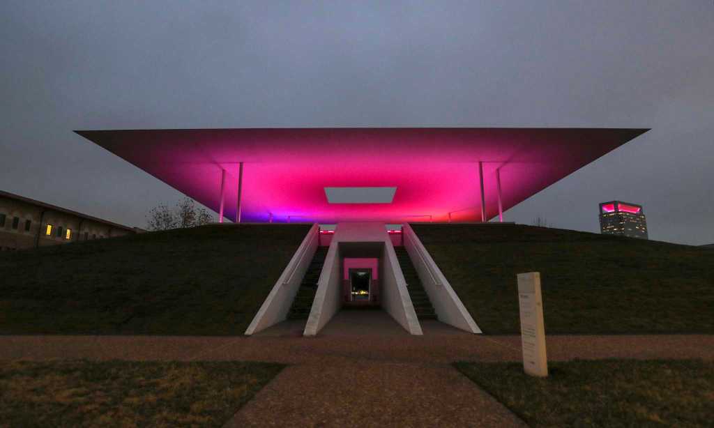
Coloured light functions in complex ways in the two light artists’ works. Turrell explores subtle gradations among colors in light, using a strategy that places viewers into contained spaces. He asks us to slow down, observe, and respond to a mea- sured sequence of changes in the light. Perhaps the best examples of this are Turrell’s skyspaces. These are buildings or earth structures, often in a pyramid or mound shape, that include openings to the sky. In the interior space, colours modulate in complex ways linked to environmental factors including seasons and times of sunrise and sunset. I will discuss two of these spaces in Houston, One Accord, at the Live Oak Friends Quaker Meet- ing House (2000) and Twilight Epiphany (2012) at Rice University. The venues are, of course, different: the first is part of an active religious institution, whereas the second is an art installation on a university campus.
Despite this difference in mission, the visual aspects of the two Houston structures work similarly. A viewer who visits near dawn or dusk will wit- ness changing light effects in relation to the sun’s movements. After people are assembled, an open- ing in the roof structure is drawn back to reveal the sky. These openings are different in construction: at the Meeting House there is an aperture in the slightly sloping roof over the interior; at Rice University, a doorway opens and closes inside a knife- edged canopy standing over the structure. Interior lighting creates illuminations in the structure that shine around the opening or reflect on the ceiling in ways that frame experience of the sky.
At the Rice skyspace rows of LED bulbs change colour across the spectrum to illuminate the white canopy overhead. These colours change gradually as the light outdoors changes. The colour of the sky takes on a wide range of new hues. It may appear to be light blue, for instance, against a darker blue projected onto the ceiling, and then shift to a much deeper shade when the interior colour modulates to pale peach. The experience is fascinating, but can also be somewhat unsettling. One’s perception of the physicality of the opening above changes as things progress. Near the end of the light show, the sky became so black above that I was concerned a thunderstorm was imminent. But the black turned out to be the roof screen slowly closing: I had mistaken the black roof covering for part of the now-dark sky.
The Quaker Meeting House and the Rice University installation, like other Turrell skyspaces, take time to experience. Surprisingly in this age of Instagram and Snapchat, when I visited at Rice, even the younger people at the Twilight Epiphany were rapt and attentive. Of course, the Quaker Meeting House presupposes a lengthy tradition of patient waiting at religious gatherings. As a Quaker himself, Turrell is familiar with the spiritual construal of light in that tradition. He explains as follows:
Well, the Quakers talk about the light inside. In fact, the light inside everyone. . . . Even with the eyes closed, we have vision, as in a dream. My grandmother believed the purpose of meditation or contemplation was to wait upon the Lord and meet up with the light inside. The temple is within. (Quoted in Govan and Kim 2013). Another example of a Turrell work was his 2013 Guggenheim exhibit Aten Reign, in which he provoked new experiences of a space very familiar to museum goers, the large Guggenheim central rotunda. He illuminated this space with a series of conical structures including LED displays to create luminous oval rings of homogenous colour in the space overhead, which included at the top an eye-like central disk or opening. Visitors responded at times simply by lying on the floor to watch the show above, “patiently staring up like it’s some sort of celestial event” (Ferro 2013). This was actually appropriate, given that the work was named after the ancient Egyptian god worshiped in association with the disk of the sun.
A similar response occurred in viewer reactions to what is probably Eliasson’s best-known work, The Weather Project in the Great Turbine Hall of Tate Modern in London (2003). This was an extraordinarily successful installation in the Great Turbine Hall. It was so popular attracting six million visitors that it had to be extended. Like Turrell, Eliasson makes expressive use of particular colours and colour combinations. Even though in many of his other works Eliasson has created a whole rainbow of colours using prisms and lenses, in The Weather Project he narrowed the palette to tones of yellow, gold, and orange.29 These are colours with strong connotations of the sun and summer.
In The Weather Project, a large central disk was hung high in the space, composed of hundreds of lights that emitted yellow rays, creating a virtual sun. Visitors enjoyed basking in this golden light to the point of lying under it and “sunbathing,” despite the absence of any actual physical warmth.30 The links between the bright yellow light and familiar summer weather were heightened by mist pumped into the hall. Mirrors added to the cocoon-like feeling by enabling people to watch themselves and others responding to the space. Eliasson has said, “I am generally not as interested in what an artwork depicts as in what it produces, its performative aspect, the way it induces you to act and behave in space” (quoted in Gilbert 2004). The work seemed to succeed in these aims at least, judging from testimony of the Telegraph’s critic Richard Dorment (2003). He noted that The Weather Project was crucially comprised by its participants: although people were reduced into identical faceless silhouettes by the blazing light, their behaviour indicated a common humanity. Eliasson, like Turrell, aims at enhancing our awareness of sensory access to the world. He encourages viewers to consider how perception works to become aware of “seeing yourself seeing” or “seeing yourself sensing. “31 In Eliasson’s Your Blind Passenger (2011) people were invited to traverse a 295-foot tunnel filled with a dense mist.
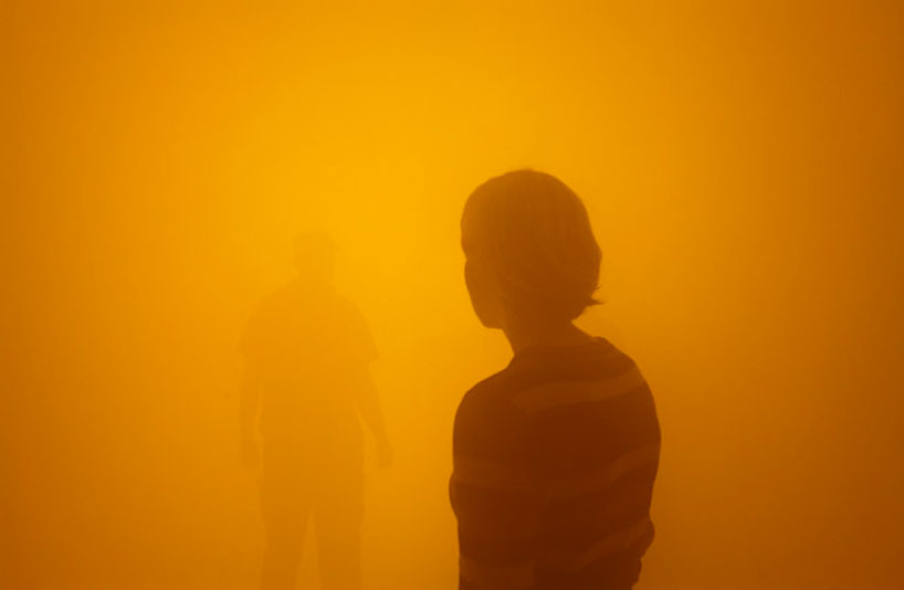
The tunnel of Your Blind Passenger was lit by white light that varied in tone from yellows to bright white to different shades of blue, replicating illumination effects of daylight. People walking through the tunnel took tentative steps due to the limited visibility. Their skin colour altered as the coloured light changed, and if they moved further ahead they became indistinct silhouettes that dissolved into the fog.32 Eliasson commented that although people felt lost at first, they quickly became reoriented through shifting to the use of other sensory modalities (2017). This installation stimulated participants to engage in something like a Cartesian project: an introspective search for self and certainty. We could also draw comparisons with Hume and his complaint that when he looks for himself, he finds nothing there.
arousing and expressing emotions in works of light art
We cannot easily account for the power of light installation works by borrowing from color science, in the way I tried to sketch above for Rothko. First, these artists employ light rather than pigment. And, second, the colours in the installations tend to shift-there is no single pair or defined combination of colours at work, as in a Rothko canvas. Perhaps some implications from research studies of people’s preferences of colour combinations might still be relevant. But there are alternative sources to draw on. Research has been conducted in a variety of fields, ranging from biology and psychology to ergonomics and architecture, concerning the effects of light on human bodies, moods, memory, and performance. The colours of light (including both brightness and wave length) affect our bodies, brains, and emotions in many ways, altering heart rate, blood pressure, melatonin levels, sleep cycles, and circadian rhythms (Stone 1999). This research has filtered out into the media of popular science and psychology. In northern climates, people know about the role of full spectrum lights in combating so-called SAD (seasonal affective disorder; Kuller et al. 2007). There is much accumulated expertise about the role of types and colors of light in helping to define space, shape mood, and elicit varied viewer reactions.
This scientific research helps explain some aspects of the emotional force of works by Eliasson and Turrell. One way they move viewers is just be- cause the light in the works affects people directly. This is what Robinson in Deeper than Reason calls arousing emotions. She describes how this differs from, but can be related to, expressing emotions by using examples from music. Music can stir us psychologically: it can calm or excite us, make us feel happy or melancholy. Such experience involves numerous physiological changes. All this is similar to how the light of installation artists’ works can affect people. Coloured environments (especially red and blue ones) affect us physically, altering alertness, brain activity, blood pressure, respiration rates, and more. In addition, Turrell uses his extensive knowledge of perceptual psychology to construct works that affect our vision directly. The colour shifts in Aten Reign, for example, trigger automatic switches between photopic and scotopic vision (between use of cones and rods in our eyes; Ferro 2013). Eliasson’s Your Blind Passenger disorients people within a world that restricts visual identification of distances and objects.
Robinson says that when moved by music, we may consider why and thus be prompted to interpret specific aspects of the music as expressive. In doing this, I might, for example, say that a song uses a minor key, slow tempo, and wailing voice to express melancholy, perhaps arousing in me a distinct emotion like nostalgia (Robinson 2005, 368-369). Light installation works may not be expressive as some music is, by conveying experiences of a persona, in the way I argued Rothko’s paintings do. But, just as expressive music employs formal musical features of a song or sonata, light art installations employ specific formal features such as location, tempo, arrangement, prescribed forms of behaviour, and so on. Like music, these are temporal artworks.
Environmental installations typically slow people down. They require attention and lingering to grasp meaning. Often these works create environments pointing to or recalling experiences of nature. People may find the experience provokes memories of a golden summer day, rainbows, the Northern lights, or a romantic twilit evening. Our responses involve recognition of distinct features we attend to. Similarly, in discussing our encounters with nature, Noel Carroll has argued that emotions are normal responses, which are not altogether subjective because they presuppose recognition of specific features of the environment. His view of emotions is similar to Robinson’s treatment of them as types of appraisals that connect bodily responses to evaluations of a situation or action. Specific objective elements of a waterfall, for example, such as its size, noise, and power, are sources of our awe and wonder. We can have similarly distinctive responses to aspects of a light installation, but, here, we are recognising features of the world that have been deliberately designed for expressive purposes. As I noted earlier, Robinson argues that art can be expressive by presenting the world as seen by someone in a particular emotion or showing what it is like for a person to see the world that way. Simplifying, an artwork provides expressive insight into how the world looks or how a person feels when viewing such a world. A nice example Robinson gives is Edvard Munch’s famous pain ing The Scream. Here we see both a character in anguish and that this character’s world is bizarre and twisted; it is a world, as Robinson puts it, “infected with the screamer’s anguish and anxiety”.
Artworks like Your Blind Passenger or Aten Reign are like the Munch painting: they show the world as experienced in a certain way: as challenging and disorienting or as mysterious and awe in- spiring. The very fact that coloured light affects our perceptual awareness can stimulate conscious reflection about the nature of perception and about how we tend to experience art and museums.36 Just as we can reflect on a musical work that arouses us, perhaps judging it to be expressive of melancholy, so too can we conclude that art installation is expressive of warmth and community, of human in- significance within the vast scope of nature, of the so-called light inside, and so on. Arousal of emotion contributes to but is not identical with recognition of the installation artist’s expressive aims.
Context is an important contributing factor (Robinson 2005, 249). The coloured lights of Turrell and Eliasson’s works are set within distinctive created environments. To experience these spaces, they must be sought out; they are wholes separated from everyday life. In Turrell’s skyspaces people must wait for the aperture to be opened; in Eliasson’s Your Blind Passenger they must enter and walk through a tunnel. There is something ceremonial or ritualistic about such a venture, which takes on the nature of a pilgrimage. This is intensified if the work is in a Quaker meeting house or has become as popular as The Weather Project. The Weather Project recalled some ancient religion of sun worship, fostering community even within the vast unfriendly space of the Turbine Hall at the Tate Modern. In Turrell’s works people look up at the vault of the sky, again as in some prehistoric ritual, as if seek- ing the meaning behind falling stars, eclipses, or other “celestial events.
Art installations by Turrell and Eliasson sometimes challenge our confidence about seeing and knowing the world. An art installation that pre- vents our ability to see space or judge distances accurately appears to thwart our very nature. We are, after all, visual creatures as the result of a lengthy and complex evolutionary process that gave certain advantages to animals that could see and hence move more efficiently around in their environment to find mates and food and avoid predators. Nevertheless, artworks that make us ponder the nature of physical reality and of how we manage to perceive it, like Eliasson’s and Turrell’s, are valuable in themselves. Colour in these artists’ works becomes something very intriguing, mysterious, beautiful, and valuable. It arouses emotions, fulfils expressive functions, and stimulates reflection about reality and ourselves. It does all this so well that I now feel better about endorsing Goodman’s claim that I quoted earlier-about how experiences of abstract work carry over when we leave the gallery or museum into the outside world by making us look at and reflect upon things very differently. Surely this is one of the best things art can do.
