Arousing & Expressing Emotions in Works of Light Art
We cannot easily account for the power of light installation works by borrowing from color science, in the way I tried to sketch above for Rothko. First, these artists employ light rather than pigment. And, second, the colours in the installations tend to shift-there is no single pair or defined combination of colours at work, as in a Rothko canvas. Perhaps some implications from research studies of people’s preferences of color combinations might still be relevant. But there are alternative sources to draw on. Research has been conducted in a variety of fields, ranging from biology and psychology to ergonomics and architecture, concerning the effects of light on human bodies, moods, memory, and performance.
The colours of light (including both brightness and wave length) affect our bodies, brains, and emotions in many ways, altering heart rate, blood pressure, melatonin levels, sleep cycles, and circadian rhythms (Stone 1999). This research has filtered out into the media of popular science and psychology. In northern climates, people know about the role of full spectrum lights in combating so-called SAD (seasonal affective disorder; Kuller et al. 2007). There is much accumulated expertise about the role of types and colours of light in helping to define space, shape mood, and elicit varied viewer reactions.
This scientific research helps explain some aspects of the emotional force of works by Eliasson and Turrell. One way they move viewers is just be- cause the light in the works affects people directly. This is what Robinson in Deeper than Reason calls arousing emotions. She describes how this differs from, but can be related to, expressing emotions by using examples from music. Music can stir us psychologically: it can calm or excite us, make us feel happy or melancholy. Such experience involves numerous physiological changes (Robinson 2005, 406-407). All this is similar to how the light of installation artists’ works can affect people. Coloured environments (especially red and blue ones) affect us physically, altering alertness, brain activity, blood pressure, respiration rates, and more (Hardin 1988, 166-167; Elliot and Maier 2014). In addition, Turrell uses his extensive knowledge of perceptual psychology to construct works that affect our vision directly. The colour shifts in Aten Reign, for example, trigger automatic switches between photopic and scotopic vision (between use of cones and rods in our eyes; Ferro 2013). Eliasson’s Your Blind Passenger disorients people within a world that restricts visual identification of distances and objects.
Robinson says that when moved by music, we may consider why and thus be prompted to interpret specific aspects of the music as expressive. In doing this, I might, for example, say that a song uses a minor key, slow tempo, and wailing voice to express melancholy, perhaps arousing in me a distinct emotion like nostalgia (Robinson 2005, 368-369). Light installation works may not be expressive as some music is, by conveying experiences of a persona, in the way I argued Rothko’s paintings do. But, just as expressive music employs formal musical features of a song or sonata, light art installations employ specific formal features such as location, tempo, arrangement, prescribed forms of behavior, and so on. Like music, these are temporal artworks.
Environmental installations typically slow people down. They require attention and lingering to grasp meaning. Often these works create environments pointing to or recalling experiences of nature. People may find the experience provokes memories of a golden summer day, rainbows, the Northern lights, or a romantic twilit evening. Our responses involve recognition of distinct features we attend to. Similarly, in discussing our encounters with nature, Noel Carroll has argued that emotions are normal responses, which are not altogether subjective because they presuppose recognition of specific features of the environment (1993, 257-260). His view of emotions is similar to Robinson’s treatment of them as types of appraisals that connect bodily responses to evaluations of a situation or action (Robinson 2005, 57-99). Specific objective elements of a waterfall, for example, such as its size, noise, and power, are sources of our awe and wonder. We can have similarly distinctive responses to aspects of a light installation, but, here, we are recognising features of the world that have been deliberately designed for expressive purposes.
As I noted earlier, Robinson argues that art can be expressive by presenting the world as seen by someone in a particular emotion or showing what it is like for a person to see the world that way. Simplifying, an artwork provides expressive insight into how the world looks or how a person feels when viewing such a world. A nice example Robinson gives is Edvard Munch’s famous pain ing The Scream. Here we see both a character in anguish and that this character’s world is bizarre and twisted; it is a world, as Robinson puts it, “infected with the screamer’s anguish and anxiety” (2005, 283).
Artworks like Your Blind Passenger or Aten Reign are like the Munch painting: they show the world as experienced in a certain way: as challenging and disorienting or as mysterious and awe in- spiring. The very fact that colored light affects our perceptual awareness can stimulate conscious reflection about the nature of perception and about how we tend to experience art and museums.36 Just as we can reflect on a musical work that arouses us, perhaps judging it to be expressive of melancholy, so too can we conclude that art installation is expressive of warmth and community, of human in- significance within the vast scope of nature, of the so-called light inside, and so on. Arousal of emotion contributes to but is not identical with recognition of the installation artist’s expressive aims.
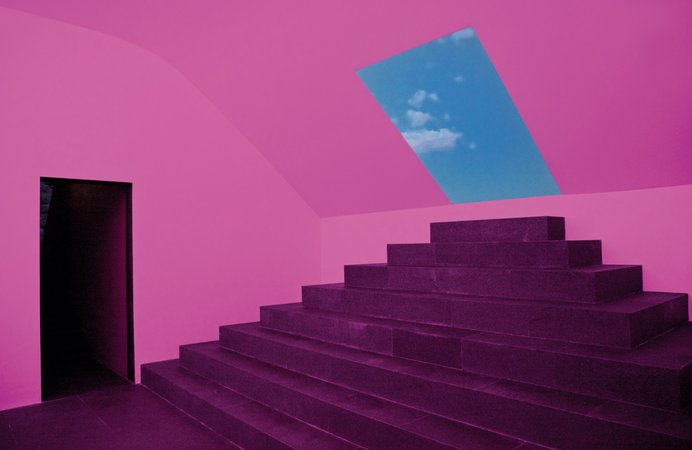
Context is an important contributing factor (Robinson 2005, 249). The colored lights of Turrell and Eliasson’s works are set within distinctive created environments. To experience these spaces, they must be sought out; they are wholes separated from everyday life. In Turrell’s skyspaces people must wait for the aperture to be opened; in Eliasson’s Your Blind Passenger they must enter and walk through a tunnel. There is something ceremonial or ritualistic about such a venture, which takes on the nature of a pilgrimage. This is intensified if the work is in a Quaker meeting house or has become as popular as The Weather Project. The Weather Project recalled some ancient religion of sun worship, fostering community even within the vast unfriendly space of the Turbine Hall at the Tate Modern. In Turrell’s works people look up at the vault of the sky, again as in some prehistoric ritual, as if seek- ing the meaning behind falling stars, eclipses, or other “celestial events.
Art installations by Turrell and Eliasson some- times challenge our confidence about seeing and knowing the world. An art installation that pre- vents our ability to see space or judge distances accurately appears to thwart our very nature. We are, after all, visual creatures as the result of a lengthy and complex evolutionary process that gave certain advantages to animals that could see and hence move more efficiently around in their environment to find mates and food and avoid predators. Nevertheless, artworks that make us ponder the nature of physical reality and of how we manage to perceive it, like Eliasson’s and Turrell’s, are valuable in themselves. Color in these artists’ works becomes something very intriguing, mysterious, beautiful, and valuable. It arouses emotions, fulfils expressive functions, and stimulates reflection about reality and ourselves. It does all this so well that I now feel better about endorsing Goodman’s claim that I quoted earlier-about how experiences of abstract work carry over when we leave the gallery or museum into the outside world by making us look at and reflect upon things very differently. Surely this is one of the best things art can do.
Far out on Long Island, in the tiny village of Springs, with the ocean as background and in close contact with open, tree-studded fields where cattle graze peacefully, Jackson Pollock lives and paints. With the help of his wife, Lee Krasner—former Hofmann student and an established painter in her own right—he has remodeled a house purchased there to fit the needs of the way of life they have chosen, and a short distance away is a barn which has been converted into a studio. It is here that Pollock is engrossed in the strenuous job of creating his unique world as a painter.
Before settling on the Island, Pollock worked for ten years in a Greenwich Village studio. Intermittently he made trips across the country, riding freight trains or driving a Model A Ford, developing a keen awareness of vast landscape and open sky. “You get a wonderful view of the country from the top of a freight car,” he explains. Pollock loves the outdoors and has carried with him and into his painting a sense of the freedom experienced before endless mountains and plains, and perhaps this is not surprising in an artist born in Cody, Wyoming (in 1912) and raised in Arizona and northern California. Included in his background is study with Thomas Benton—for whom he was at one time a baby sitter on New York’s Hudson Street—but he has mainly developed by himself, in contemplation of the lonesome silence of the open, emerging in the last few years as the most publicized and controversial of younger abstractionists. He is also one of the most successful.
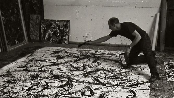
To enter Pollock’s studio is to enter another world, a place where the intensity of the artist’s mind and feelings are given full play. It is the unusual quality of this mind, penetrating nature to the core yet never striving to show its surface, that has been projected into paintings which captivate many and agitate others by their strange, often violent, ways of expression. At one end of the barn the floor is literally covered with large cans of enamel, aluminum and tube colors—the boards that do show are covered with paint drippings. Nearby a skull rests on a chest of drawers. Three or four cans contain stubby paint brushes of various sizes. About the rest of the studio, on the floor and walls, are paintings in various stages of completion, many of enormous proportions. Here Pollock often sits for hours in deep contemplation of work in progress, his face forming rigid lines and often settling in a heavy frown. A Pollock painting is not born easily, but comes into being after weeks, often months of work and thought. At times he paints with feverish activity, or again with slow deliberation.
After some years of preparation and experimentation, during which time he painted his pictures on an easel, Pollock has developed a method that is unique and that, because of its newness, shocks many. He has found that what he has to say is best accomplished by laying the canvas on the floor, walking around it and applying the paint from all sides. The paint—usually enamel, which he finds more pliable—is applied by dipping a small house brush or stick or trowel into the can and then, by rapid movements of the wrist, arm and body, quickly allowing it to fall in weaving rhythms over the surface. The brush seldom touches the canvas, but is a means to let color drip or run in stringy forms that allow for the complexity of design necessary to the artist.
In his recent show, at the Parsons Gallery, Pollock exhibited a very large work, titled Number 4, 1950. (Pollock used to give his pictures conventionally symbolic titles, but—like many contemporary abstractionists—he considers them misleading, and now simply numbers and dates each work as it is completed.) It was begun on a sunny day last June. The canvas, 9 by 17 feet, was laid out flat, occupying most of the floor of the studio and Pollock stood gazing at it for some time, puffing at a cigarette. After a while he took a can of black enamel (he usually starts with the color which is at hand at the time) and a stubby brush which he dipped into the paint and then began to move his arm rhythmically about, letting the paint fall in a variety of movements on the surface. At times he would crouch, holding the brush close to the canvas, and again he would stand and move around it or step on it to reach to the middle. Within a half hour the entire surface had taken on an activity of weaving rhythms. Pools of black, tiny streams and elongated forms seemed to become transformed and began to take on the appearance of an image. As he continued, still with black, going back over former areas, rhythms were intensified with counteracting movements. After some time he decided to stop to consider what had been done. This might be called the first step of the painting, though Pollock stresses that he does not work in stages. He did not know yet when he would feel strongly enough about the picture to work on it again, with the intensity needed, nor when he would finally be finished with it. The paint was allowed to dry, and the next day it was nailed to a wall of the studio for a period of study and concentration.
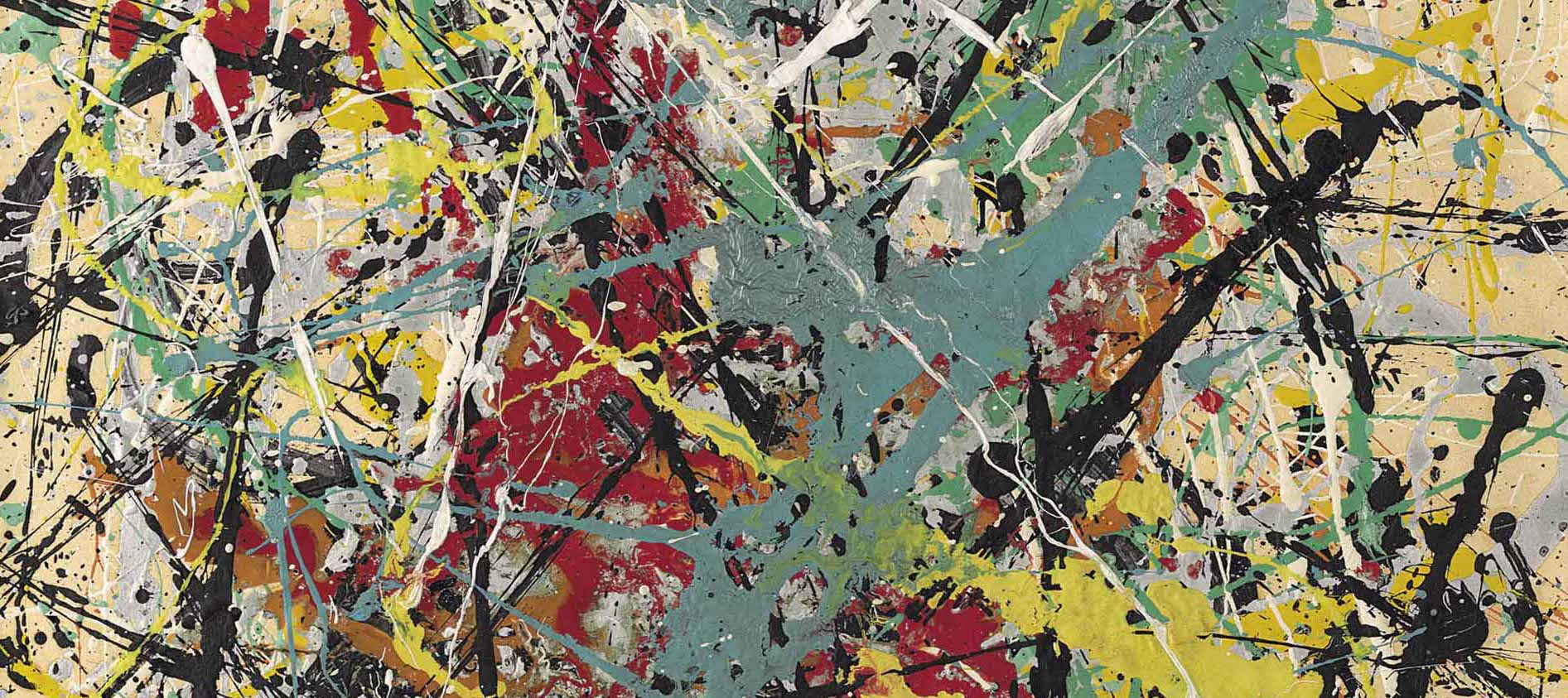
It was about two weeks before Pollock felt close enough to the work to go ahead again. This was a time of “getting acquainted” with the painting, of thinking about it and getting used to it so that he might tell what needed to be done to increase its strength. The feverish intensity of the actual painting process could not be kept up indefinitely, but long periods of contemplation and thought must aid in the preparation for renewed work. In the meantime other paintings were started. When he felt able to return to the large canvas with renewed energy, Pollock placed it back on the floor, selected a light reddish brown color and began again to work in rhythms and drops that fell on uncovered areas of canvas and over the black. Occasionally aluminum paint was added, tending to hold the other colors on the same plane as the canvas. (Pollock uses metallic paint much in the same sense that earlier painters applied gold leaf, to add a feeling of mystery and adornment to the work and to keep it from being thought of as occupying the accepted world of things. He finds that aluminum often accomplishes this more successfully than greys, which he first used.) Again the painting was allowed to dry and then hung on the wall for a few days’ renewed consideration.
The final work on the painting was slow and deliberate. The design had become exceedingly complex and had to be brought to a state of complete organization. When finished and free from himself the painting would record a released experience. A few movements in white paint constituted the final act and the picture was hung on the wall; then the artist decided there was nothing more he could do with it.
Pollock felt that the work had become “concrete”—he says that he works “from the abstract to the concrete,” rather than vice versa: the painting does not depend on reference to any object or tactile surface, but exists “on its own.” Pollock feels that criticism of a work such as this should be directed at least in terms of what he is doing, rather than by standards of what painting ought to be. He is aware that a new way of expression in art is often difficult to see, but he resents presentation of his work merely on the level of technical interest.
Such a summation of Pollock’s way of working is, of course, only part of the story. It has developed after years of concentrated effort, during long periods when nothing was satisfactory to him. He explains that he spent four years painting “black pictures,” pictures which were unsuccessful. Then his work began to be more sure. There was a period of painting symbols, usually of figures or monsters, violently expressed. Of them, She Wolf, now owned by the Museum of Modern Art, was a crucial work. Here areas of brush-work and paint-pouring were combined, the painting being done partly on the floor and partly on the easel. The change to his way of working today was gradual, accompanying his various needs for expression, and though there is a sense of the brutal in what he does this gradually seems to be giving way to greater calm.
During the cataclysmic upheavals painting has undergone in recent years there have been rather drastic measures taken with the object. It has been distorted and finally eliminated as a reference point by many artists. The questions arise as to what the artist is dealing with, where he gets his ideas, what his subject matter is, etc. The answer may be found partly in the consideration that these artists are not concerned with representing a preconceived idea, but rather with being involved in an experience of paint and canvas, directly, without interference from the suggested forms and colors of existing objects. The nature of the experience is important. It is not something that has lost contact with reality, but might be called a synthesis of countless contacts which have become refined in the area of the emotions during the act of painting. Is this merely an act of automatism? Pollock says it is not. He feels that his methods may be automatic at the start, but that they quickly step beyond that, becoming concerned with deeper and more involved emotions which carry the painting on to completion according to their degree of strength and purity. He does not know beforehand how a particular work of his will end. He is impelled to work by the urge to create and this urge and what it produces are forever unknowable. We see paint on a canvas, but the beauty to which we respond is of an intangible order. We can experience the unknowable, but not understand it intellectually. Pollock depends on the intensity of the moment of starting to paint to determine the release of his emotions and the direction the picture will take. No sketches are used. Decisions about the painting are made during its development and it is considered completed when he no longer feels any affinity with it.
The work of art may be called an image which is set between the artist and the spectator. A Pollock reveals his personal way of bringing this image into existence. Starting automatically, almost as a ritual dance might begin, the graceful rhythms of his movements seem to determine to a large extent the way the paint is applied, but underlying this is the complex Pollock mind. At first he is very much alone with a picture, forgetting that there is a world of people and activity outside himself. Gradually he again becomes aware of the outside world and the image he has begun to project is thought of as related to both himself and other people. He is working toward something objective, something which in the end may exist independently of himself, and that may be presented directly to others. His work may be thought of as coming from landscape and even the movement of the stars—with which he seems almost intimate at times—yet it does not depend on representing these, but rather on creating an image as resulting from contemplation of a complex universe at work, as though to make his own world of reality and order. He is involved in the world of art, the area in which man undertakes to express his finest feelings, which, it seems, is best done through love. Pollock, a quiet man who speaks with reserve and to the point, is in love with his work and his whole life evolves about what he is doing.
He feels that his most successful paintings carry the same intensity directly to the edges of the canvas. “My paintings do not have a centre,” he says, “but depend on the same amount of interest throughout.” Since it has no reference to objects that exist, or to ideal objects, such as circles and squares, his work must be considered from the point of view of expression through the integration of rhythm, color and design, which he feels beauty is composed of. Physical space is dispensed with as an element in painting—even the dimensions of the canvas do not represent measurements inside which relationships are set up, but rather only determine the ends of the image.
Pollock’s Number 4, 1950 is concerned with creating an image in these terms. In this it is like much of his other work, but it is also among his most successful paintings, its manifold tensions and rhythms balancing and counteracting each other so that the final state is one of rest. In his less realized paintings one feels a lack of rest: movements have not been resolved. Colors in Number 4, 1950 have been applied so that one is not concerned with them as separate areas: the browns, blacks, silver and white move within one another to achieve an integrated whole in which one is aware of color rather than colors. Nor is the concern with space here. There is no feeling that one might walk bodily into the rectangle and move about. This is irrelevant, the pleasure being of a different nature. It is more of an emotional experience from which the physical has been removed, and to this intangible quality we sometimes apply the word “spiritual.”
In this picture Pollock has almost completely eliminated everything that might interfere with enjoyment of the work on this level. It is true the painting is seen through the senses, but they are only a means for conveying the image to the aesthetic mind. One is not earthbound in looking at Number 4, 1950. In lesser paintings one does not feel this sense of release from physical reactions. The experience Pollock himself has had with this high kind of feeling is what gives quality to his work. Of course anyone can pour paint on a canvas, as anyone can bang on a piano, but to create one must purify the emotions; few have the strength, will or even the need, to do this.
By Cynthia Freeland The Journal of Aesthetics and Art Criticism 2017
I now turn to my new question about colour: What is the role of colour in expression? I cannot hope to answer this as a general question. But to try to advance at least some way, I will take up the example of Mark Rothko. Many critics agree that Rothko’s paintings evoke unusually strong emotional responses in viewers and that this is mainly due to their use of colour. In histories of modern art, Rothko is usually classified as a colour field painter, although he himself rejected accounts of his works that focused on formal features. Rothko staunchly defended claims about his works’ expressive aims.
I’m interested only in expressing basic human emotions – tragedy, ecstasy, doom, and so on – and the fact that lots of people break down and cry when confronted with my pictures shows that I communicate those basic human emotions. . . . The people who weep before my pictures are having the same religious experience I had when I painted them. And if you, as you say, are moved only by their colour relationships, then you miss the point! (quoted in Rodman 1957, 94)
Many viewers agree and find Rothko’s paintings unusually potent. Indeed, James Elkins speculates in his wonderfully titled book Pictures and Tears: A History of People Who Have Cried in Front of Paintings that more people have wept before Rothko’s works than those of any other painter (2004, 4). And the colours in the works are central to the viewers’ intense responses. Elkins comments, “From a distance a Rothko painting can be pleasing and even pretty. If you walk up to it, you may find yourself lost in a smear of colors.” He adds: If you step too close to a Rothko, you may find yourself inside it. It is not hard to see why people say they are overwhelmed. Everything conspires to overload the senses: the empty incandescent rectangles of colour, entirely encompassing your field of vision; the sheer glowing silence; the lack of footing, or anything solid, in the world of the canvas; the weird sense that the colour is very far away, yet suffocatingly close. It’s not a pleasant feeling: the painting is all around you, and you feel both threatened and comforted, both cushioned and asphyxiated.
There are few philosophical discussions of how colour operates expressively in Rothko’s paintings. As perceptive a critic as Arthur Danto was sceptical about the kinds of grandiose claims made on behalf of the work by both the artist and his fans. In his essay “Rothko’s Material Beauty,” Danto said that one of the works ”shows what materiality comes to when it does not evoke something deeper than itself” (quoted in Boxer 2000). To him the works were only about beauty. However, some philosophers have found more depth in Rothko’s works. Selma Kraft, writing in 1986, argued as follows:
In 1947 Rothko began to probe a new area of meaning: colour as the source of an indefinitely open, expanding experience in which the boundaries between viewer and viewed, space on canvas and beyond, are obliterated. In his attention to the possibility of lifting the emotional experience of colour beyond something closed and finite, Rothko went beyond the questions explored by such earlier innovators in the meaning of colour as Gauguin, Matisse, and Kandinsky. [His works] made it possible to express a new general kind of meaning. Kraft’s claim that Rothko expresses “a new general kind of meaning” sounds promising. But just what is this meaning?
I am reminded by Kraft’s vagueness of my dissatisfaction with Nelson Goodman’s claims about the intellectual impact of abstract art in Ways of Worldmaking. Goodman argues that time spent with abstract art affects our subsequent experience: “Everything tends to square off into geometric patches or swirl in circles or weave into textural arabesques, to sharpen into black and white or vibrate with new colour consonances and dissonances”. But I am not sure it is the world outside the museum that vibrates with new colour consonances when we leave a Rothko exhibition – it is the paintings themselves that vibrate. Perhaps, too, something about ourselves and our own inner states is transformed.
More help comes from a subsequent article in which Katherine Thomson-Jones took up the challenge of specifying content in abstract art. In her article, “Inseparable Insight: Reconciling Cognitivism and Formalism in Aesthetics,” Thomson- Jones sketched what Kraft may have intended: Rothko’s work is about something, namely, our very own experience of colour. Many minimalist artworks are about something in this sense, precisely because they are minimalist. . . . What is interesting about Kraft’s argument is that she applies the semantic distinction between form and content to a corpus of artworks that is not obviously representational. . . . [T]he semantic distinction can be applied to minimalist art like Rothko’s insofar as such work has meaning that is articulated in a certain way.
It is refreshing to hear such a clear claim that nonrepresentational works can have semantic content. But the content suggested here by Thomson-Jones is still too minimal to account for many viewers’ strong responses to Rothko’s paintings. Abstract works understood this way are about art or about themselves; the colors are about colour. This leaves us a long way from Rothko’s grand themes of ecstasy, fate, and doom. Thomson-Jones does take things further, though, by suggesting that, on certain views of emotions, an artwork that stimulates exploration of our inner emotional lives can have cognitive dimensions that inform us about our lives and ethical views.
Just as the way I respond to a situation establishes its significance for me, so the way an artist presents the subject of his or her work establishes my ability to see new significance in familiar aspects of ethical life. These two ways of learning from art show that the inseparability of form and content in art need not rule out the aesthetic relevance of learning from art. Thomson-Jones’s idea that emotional insight or reflection stimulated by an artwork can inform ethical life is interesting and offers further specification of Goodman’s claims about abstract art. But the challenge about Rothko’s expressive power remains, because Thomson-Jones’s main examples to illustrate how emotional experience can lead to ethical insight are from works by authors like Charles Dickens and Toni Morrison. It is easier to see in such literary cases how processes of identification, empathy, and moral assessment are facilitated by readers’ emotional responses.
Recall Rothko’s claim that his paintings are about basic human emotions and that if audiences respond, then they feel what he was feeling while painting them. This reflects a theory of expression sometimes called the contagion view, which treats art as an expression of the artist’s own emotions, a view presented by Tolstoy (1996) in What Is Art? On this view, expression works in a direct way: the artist has a feeling, somehow puts it into the work, and it is transferred to the audience. This view has many critics. A prominent alternative is Peter Kivy’s account of expression in music, developed in The Corded Shell (Kivy 1980). Kivy speaks of an artwork as expressive of emotion rather than expressing it. Aspects of music are expressive due to their resemblance to familiar cases of human expressiveness. As an example of this “contour theory,” Kivy mentions how a Saint Bernard’s face can be expressive of sadness without the dog itself being sad. A major challenge for the art critic attempting to account for expressiveness in Rothko’s mature works is their simplicity. This is particularly true of the very large and dark coloured canvases in the Houston chapel that bears his name. Elkins cites remarks from the Rothko Chapel visitors’ book saying things like “I felt crushed,” “I was moved to tears,” and “It is a visually and viscerally stunning experience”.
Basically, the contour theory posits recognition of some observable similarity to human expression of emotion. Trying to apply the contour theory to the Rothko Chapel murals, we might draw comparisons between their dark colors and people’s dark moods or dark faces.13 Generally, faces are termed “dark” when they are angry (angry people’s faces tend to become more red), and moods are dark when someone is depressed. But such comparisons seem superficial. It is too easy to draw links between the dark colors of the Rothko Chapel canvases and facts we know about the artist’s depression and eventual suicide.
Talk of the “dark” paintings seems not so much to involve visual similarities as using “dark” metaphorically. Elkins surely uses the term in a metaphorical way when he says, “I think Rothko was trying to learn how to live with pure unrelieved darkness”. The contour theory fails to recognise that the murals were designed for a (nondenominational) chapel-that is, for a religious setting. In addition, the paintings in situ change appearance in surprising ways due to the skylight overhead that allows for shifting natural light. Or, at evening events, the works take on yet another appearance when lit by flickering candelabra.
Perhaps the paintings are dark in order to convey mystery and stimulate meditation in a cave-like atmosphere. For some viewers this experience is fruitful; for others, off-putting. The latter was Elkins’s reaction. After a few days of studying the murals and how visitors react to them, he writes: The paintings are like black holes, absorbing every glint of light, sopping up every thought. Wherever you turn, they face you, and show you nothing but blackness. They say nothing and depict nothing: they just bear down. I had felt some of that the day before, and I had started taking notes partly to avoid thinking about it. Other people just close their eyes and meditate, released from Rothko’s weird unhappiness into their own more pleasant thoughts.
The Rothko Chapel murals are atypical in the artist’s oeuvre in using very dark shades of black, blue, and purple. I would like to move toward understanding how other examples of Rothko’s paintings express emotions. Suppose that we pursue the ideas from Kraft and Thomson-Jones that Rothko’s paintings are about our own experiences of colour and that these experiences lend themselves to acts of emotional appraisal that can inform our lives. Here we can benefit from the theory of expression developed by Jenefer Robinson (2005) in her book Deeper than Reason. Robinson offers a careful defence of the idea that emotions are types of “affective appraisals” of the world. Her account of expression, the “new Romantic theory,” is a revised version of the position articulated by R. G. Collingwood, who held that artists work out their ideas and emotions in forms suitable for embodying them.
In its primary sense expression is something intentionally brought about by an artist that consists, roughly speaking, in the manifestation and elucidation of an emotional state of a persona in the expressive character of a poem, a painting, a piece of music, etc., such that the work provides evidence for the emotional state of the persona and the persona’s emotional state is communicated to other people . . . through the character of the work.On Robinson’s account, an artwork gives evidence that a persona in the work has experienced an emotion. The emotion is intentionally put in the work and in turn perceived by the audience; in this process the artist and audience both become clearer about the emotion.
Robinson outlines how her account can be applied to examples of expression in various artistic genres ranging from music to literature and painting. She writes, for example, that some musical works “should indeed be experienced as containing a persona whose unfolding emotional life is portrayed in the music”. The case is similar for painting. Here Robinson writes: Representational paintings can also express emotions in a double way. On the one hand a painting can convey a point of view by presenting a vision of the world as seen from the viewpoint of a person in the throes of a particular emotion. On the other hand, a picture can also convey something of what it is like for a person to view the world in that way: it can show the person him- self or herself and how the emotion affects him or her. As examples, Robinson discusses various representational works by Friedrich, Delacroix, Munch, and Kirchner. Stylistic features such as “violent brushwork and lurid colours” can express a painter’s attitude, “or that of his artistic persona” (2005, 276). What about nonrepresentational works? Despite not depicting characters, Robinson argues, abstract works can also manifest expressive actions – as for example with Pollock’s drip paintings. We can see the actions constituting these works, and such paintings might express emotions in a way comparable to how dance does, by enacting gestures or behaviours of someone manifesting an emotional state.
Robinson’s “new Romantic theory” of expression offers a promising avenue for de- scribing Rothko’s use of colour. Remember that we can recognize intended expressive aims in works without necessarily experiencing the emotions that are expressed. This way of putting things helps fill out missing details of Thomson- Jones’s idea that even abstract art can provide illumination about our emotional and moral life. It is more accurate to say that people who are moved by Rothko’s paintings are moved by seeing the world in a new way or realising something about emotional life than to insist on a direct transmission of feelings, as Rothko did (along the lines defended by Tolstoy).
We see and understand the emotional expressiveness of Rothko’s works because of very specific ways in which the stylistic components (especially colors) function in his mature paintings. Bianca Bromberger offers some help on this: “His paintings, he believed, were ‘dramas’ and the presences of light in the pictures were ‘performers.’ These shapes ‘have no direct association with any particular visible experience, but in them one recognizes the principle and passion of organisms'” (2008, 12-13, citing Rothko 2004, 33 and 35). Rothko himself gave reasons for viewing his central shapes as playing the role he claimed form them, as the counterpart of figures or organisms. He felt a very strong need to eliminate the human figure in his works. He wrote, ‘I belong to a generation that was preoccupied with the human figure and I studied it. It was with most reluctance that I found that it did not meet my needs. Whoever used it mutilated it. No one could paint the figure as it was and feel that he could produce something that could express the world. I refuse to mutilate and had to find another way of expression. (Rothko, quoted in Greene 2015, 168)
Of course, we do not have to take Rothko at his word about how elements of his paintings work. We could dismiss his claims as grandiose, as Danto apparently did. But I think it is fruitful to consider relationships between the central blocks of colour in Rothko’s paintings as dynamic and therefore gestural. The simple looking rectangles of colour of the mature canvases function like dramatic figures engaged in intricate relationships. The shapes and their interactions can be regarded as personas that manifest emotions; they are stand-ins for the personas Robinson wrote about in representational works, showing us how it feels to be in the throes of certain emotions, or how the world looks to someone with those emotions. To begin filling this out, let me cite a descriptive analysis of one of Rothko’s works. This is from the Phillips Collection (2017) website concerning the painting Ochre and Red on Red.
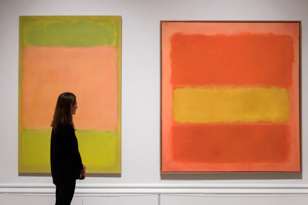
In Ochre and Red on Red a buoyant effect is created by the blazing yellow square, which, in comparison to the darker red of its surroundings, appears to surge out of the composition into the viewer’s space. Ochre and Red on Red becomes an example of Rothko’s highly emotional works with its high-keyed pigments and vibrant colours. This analysis makes a good start at identifying the expressive components (“personas”) of Ochre and Red on Red. The features cited here are of the right sort. They involve specific facts about this work with expressive potential: its yellow square and its red background and how they are related. These parts are characterised by use of terms like “blazing” and “high-keyed”; the yellow square is “surging out of the composition.”
Taking this lead, we can identify numerous factors in Rothko’s paintings that make their coloured sections – rectangles, backgrounds, and edges – function expressively. Because of the paintings’ scale, their surface treatment, choices of pigment and its application, and colour relationships, they do appear to manifest expressive actions and attitudes. It is important to remember the works’ size. Rothko’s mature canvases (1950- 1958) are typically quite large, as large as six by nine feet. When viewed from close up, Rothko recommended a distance of just 18 inches, the paintings envelop our visual field.18 (This enveloping strategy will become even more salient, as we shall see, in the light installations of Turrell and Eliasson.) Rothko wanted the works to be hung at eye level and with indirect, even dim, lighting. He typically painted over the edge of the canvas. These factors work to heighten the envelopment effect and to bring the simple components of the paintings to our attention.
In Rothko’s signature works these components are two unequally sized rectangular shapes with indefinite edges that appear to float against a different coloured background. He employed various techniques to apply the paint, including staining, so it is rare to see evidence of brush strokes, though one can discern streaks, patches, feathering, and under-layers. The colours are distinctive and saturated, but not uniform. Standing eye to canvas we can notice textures and subtle differentiations in colour along with individual quirks such as a block’s blurred edges. The dynamism of the forces at work results from specific aspects of the composition, including hue and saturation, intensity, and edge treatment. We should also notice the selection of backgrounds and the thin lines of border colours that are sometimes interposed between the two central masses.
Especially when a viewer stands very close, the large vague shapes of these paintings, with their indefinite boundaries, seem to move; critics comment that the shapes appear to pulse from within. Sometimes the material substance of the picture seems to be either receding or pushing outward. (Remember the remark above about how yellow of Ochre and Red on Red “seems to surge out . . . into the viewer’s space.”) Within their typically vertical format, due to the uneven size of the rectangles, it can look as if the shapes are not in balance: either one is erupting upward or one is pressing the other down. Elkins comments in a similar vein about one of the Rothko Chapel paintings that “the black rectangle is up at the top as if it has floated there against the law of gravity”. The active interaction of the shapes is akin to the gestural interaction of dancers.
The Easter break from Truro College of Art & Design can bring unique rewards for those students who are eager to be inspired by true craftsmanship, adding valuable development opportunities which can be implemented within their own practice. Our most experienced silversmith and jeweller Martin Page, brings a wealth of knowledge and experience ‘to the peg’. Martin has studied and worked in the creative industry since first undertaking a diploma in art and design at Central School in 1970, a creative journey honoured with pieces added to National collections throughout the Uk including including Victoria and Albert Museum, The National Museum of Scotland, Nottingham Castle Museum and The Worshipful Company of Goldsmiths.
Students attended a one day workshop acquiring the traditional skills of stone setting including gypsy (flush), bezel and pave. There are other extra curriculum workshops held throughout each academic year.
Silversmithing and Jewellery Fda / BA course details here.
FORM & OBJECT (Art) : An anatomical appearance, decomposed position in parts, a fragile mechanised articulation, a sense of a progressive continuity and configuration amongst the industrialised linkages (the chain of events) positioned to remove any contrivance, an elegant appearance, unusual, exotic and remote, aesthetically pleasing, centred with a mystique and harmonising stature, hypnotic, accommodating meditation for a restful eye, symbolism; a compartment, a locket for the soul perhaps, the centre of all things, the heart of craftsman? the centre of emotional expression? archetype form; the circle consciously reinforced by repetition, more revered than a dome, however, the dome encapsulates and creates a formal utility, usefulness. The centre is a circle, Young (Man & His Symbols) suggests the circular form represents a persons individual progression, a cultural numinous. In Zen Buddhism, the circle is a metaphor for a journey towards enlightenment via form, a duality, emptiness is form, form is emptiness, what is absent is relevant, space is form.
UTILITY & SUBJECT (Nature) : A naturalistic aura emanating an chthonic atmosphere, seemingly skeletal, osseous matter punctured femoral heads, reminiscent of Natures decadence, of Natures primary roots, the first tentative organ to life, hinged and centred by a singular pierced cell, the heart of the subject, subjectivity is the person, the centre piece perhaps represents an encapsulated ‘pneuma’, the ancient Greek nomenclature for air/breath or spirit, a pneumatic soul (air/soul), evidence of the makers intention to express her benevolence towards Nature, the path dictated by our aboriginal ancestors, her profound spiritual acknowledgement of Natures spiritual omnipresence and an acknowledgment of being a custodial of Mother Earths unescapable incessant rhythms, a physical and an unpublished kinship. FL HPA24
Indeed, such a presentation of individual forms (created moments) can resonate a primal emotion within, where any language outside of art can be unwittingly, albeit artificially implemented to express an individuals personal (id/ego) idea of an emotive response leading to a confinement of category. The language of art exists to frame a sense of categorisation to induce a moment of universal agreement towards a realisation of a unique aesthetic, however, this nomenclature too, at times, fails to differentiate. Identifying (archetypal) symbolism, as Young might argue, is perhaps more profound in establishing a sense of the makers intent and identity through the created object. Remove language, concepts and categories, what remains is a true sense of beauty and meaning.
The International Baccalaureate Diploma is a two-year Level 3 course that students with diverse interests may consider as an excellent alternative to A Levels.
The Diploma is an internationally recognised university entry qualification, offered in 159 countries throughout the world. It is fully recognised by all UK universities. As interest in the IB grows, more institutions are offering the Diploma. Truro College is the only provider of this programme in Cornwall, and it is one of the biggest and most successful in the UK.
IB 2024 college students have curated their own exhibition spaces, a progressive and important activity sustaining their method of narrative.
from the representation of the ideal human form to complete abstraction
The Three Fates of the Parthenon, ‘Moirai’, also known as the ‘triple moon-goddess’ hence their white robes, transcribed to Roman mythology as ‘Parcae’, Birth, Life and Death, the corporeal material thread of life spun, apportioned and severed. Grecian deities of destiny and inevitability, mistresses of the loom, honoured as Clotho, Lachesis and Atropos; eponymously tasked as the Spinner, the Allotter (designating an individual’s place in society) and the Inflexible or my bid, the Immutable, as death is finite.
Arbiters of the deamonic Earth spirits, ‘persons of the lesser’, and of the Gods, to whom Zeus himself is a subject of their whim.
Atropos spontaneously severing the thread, the ‘cutting off’ from the aqueous chthonic matrix, of our aboriginal genesis, rescinding Dionysian liquidity, ‘the invisible sea of organic life’ (Paglia), a metaphor for death, abrupt and resolute.
These ethereal inamorata, agents of intimacy, preside headless, all seeing without sight. Conversing in silence, there’s no requirement for extraneous vision, visual perception may infuse limerence and deviate judgement.
Draped in a translucent yet seemingly heavy-set servient peplos, an annual ritual clothing of Athena worship, suggests a sense of the incumbent burden of their boundless charge, conjointly inducing a sense of the intermediary connection to all mortals, the threads of ‘pneuma’, a fabricated undulating conduit for the breath of adolescent life and mortality.
The Maidens fate? a timeless foe, Nature. Natures tyranny is ceaseless, all pervading, gnawing and souring the ethereal garment [ρούχο], a naked ambition, witness the residue, a patina of decomposition, of weathering. These matriarchal deities can command fate, however, the benign relentless curse of Nature is indiscriminate and malevolent, determined to deface, to embarrass and quell the opulence of the Spinners serenity. Nature cannot be heeded, seemingly adolescent, She too is ageless, immortal. Her authority, Her maturation lays evident on all indigenous matter. FLHPA 2024
Representation; Dionysian energy, charges ‘matter and motion’, Natures agitating tyranny, where objects exhibit the ethereal spirit of substance, the augmentation of emotions.
Context; the maidens peplos, of drapery and pneuma thread. Mimesis [muh’me:sis]; a re-presentation of Nature (mythos & subjectivity).
Technique; [techne or the ‘know-how’] – an act of fold-forming. Material – copper. Patina – liver of sulphur.
Abstraction; the Apollonian line, defines and separates objects from Natures flux. the freezing and purification of matter, unity and simplicity, humans command of Nature’s tyranny, distinguishing oneself from Nature.
act one – contemplatingact two – conversing
In context – The maidens in silent contemplation (1); in gossiping and discussion (2). Poiesis [poi’ye:sis]; the act of formation and control of substance (logos and objectivity).
Many of our students participate in projects involving photography including stop-motion-capture. Can such practices be considered art? or, forms of art? What about film? Both students and lecturers are interested in the aesthetics of the moving image through various formats. Some drawn to narrative, some drawn to singularly visual content, some drawn to costume and some drawn to the philosophical discussions there-after. Professor of Film Studies at Kent University, Murray Smith posits arguments for and against film as art.
Film and the established arts
Arguments against film as an art vs Arguments for film as an art
Scruton writes of the “fictional incompetence” of cinema (Scruton 1983: 112), suggesting that the fictional dimension of a film is held in check by the fact that the fiction depends on the recording, visually and aurally, of an actual space and time. The fiction of Rhett Butler and Scarlett O’Hara embracing in an antebellum mansion in Georgia depends on a depiction of Clark Gable and Vivien Leigh embracing under arc lights in a studio in California. Now, the importance of this is that it reveals a particular type of aesthetic criterion: a fiction, as a type of aesthetic object, must not be bound to a mere recording of (some part of) reality. “It is only because of their absolute lifelikeness – their absolute truth to the ways things appear – that these [cinematic] images exert their fascination . . . Before the imagination can arrive at its truth, it must pass through the world of fiction” (Scruton 1981: 86). The aesthetic object is such by virtue of a creative or imaginative transformation of what it represents, and film, due to its character as a recording device (a ‘phonograph for the eyes,’ as often been a disdain for the artistic dimensions, achievements or potential of film. A usefully extreme version of such disdain can be found in the work of the conservative philosopher Roger Scruton who, in his discussions of photography and film, excludes the mass of popular fiction film making from the possibility of aesthetic achievement or distinction, dismissing it as the “mass marketing of sentimentality under the guise of imaginative drama” (Scruton 1981: 86). Thomas Edison conceived of it), is ‘incompetent’ in performing this function: films can perform an aesthetic function, but only so far and never very well.
Scruton is not a major theorist or critic of film, and his arguments are not extensively developed, but they serve to introduce two traditions of thought about the aesthetic potential of film which are of greater significance. First, Scruton’s attitudes to film, and popular film in particular, were in many ways prefigured by the Marxist philosopher and aesthetician Theodor Adorno. For Adorno, the aesthetic potential of film was corrupted by the mechanical and commercial nature of film making, this commercial function conflicting with the ‘autonomous’ development necessary for art, debasing the Kantian ‘purpose- lessness’ of art into the barren ‘purpose’ of commerce (Adorno and Horkheimer 1979: 158). Adorno’s hostility to film and its aesthetic potential was, however, far from the dominant attitude among early and classical film theorists (those writing up to roughly 1925, and those writing from around 1925 through the 1950s, respectively). It is among such figures that we find the second overlap with Scruton, though their arguments move in the opposite direction to those of Scruton. Theorists such as Rudolf Arnheim, Béla Balázs and Sergei Eisenstein also examined film in the light of traditional aesthetic criteria, in order to demonstrate that film was capable of aesthetic achievement, rather than to expose its (supposed) failings in this regard. The major project of early and classical film theory was to demonstrate that film was truly the ‘seventh’ art (or the sixth or the eighth, depending on how you count). Writing in 1922, Eisenstein and fellow Soviet film maker Sergei Yutkevich proclaimed that “the genius of Charlie Chaplin” had taken “the eighth seat in the Council of Muses” (Eisenstein 1988: 29).
Arguments for film as an art
Along with those of Lev Kuleshov, V. I. Pudovkin and Dziga Vertov, Eisenstein’s theoretical writings grew out of, and developed in relation to, film making practice, both his own and the practice of other directors and other traditions of film making. Writing and filming from the early 1920s onwards, the revolutionary social and political context of Eisenstein’s work inflected his use of, and perspective on, the concept of art, drawing it away from considerations of ‘beauty’ or ‘disinterest,’ and towards its role in galvanizing an audience in relation to the practical matters of revolution and social change: Eisenstein wrote of “an ever deeper immersion in the dialectical principles of militant materialism in the field of art” rather than a concern with “aesthetics” (Eisenstein 1988: 244; see also 161–2). Abstract as this declaration sounds, his theoretical work is in fact littered with concrete examples, focusing on the construction of films at every level: the composition of the shot, the editing of the sequence, the overall force of a film. This is a vestige, perhaps, of his early training as an engineer, and very much part of a general (anti-Kantian) emphasis on the utility of art, on didacticism and tendentiousness, and the prioritizing in the early Soviet Union of the arts of design, architecture, documentary (‘factography’) and propaganda. The central organizing concept for Eisenstein was, of course, the notion of montage. Although conceived initially in terms of the editing of shots, the concept came to refer more broadly to the creation of new, higher levels of meaning and experience through the juxtaposition of any more basic elements. Eisenstein discriminated different types of montage and elaborated the notion in numerous directions (see, for example, Eisenstein 1988: 161–94).
Eisenstein’s theoretical work represented the reflections of a film maker on his own and others’ film making, and neither aspired to nor achieved a completeness or systematicity. A very different and more academic approach was undertaken by Arnheim, who produced the most systematic pre-war treatise on film-as-a- traditional art, Film als Kunst (1932) (translated into English in 1933 as Film; shortened and revised in 1957 as Film as Art). Arnheim’s education was in Gestalt psychology, philosophy and art history, and his work is infused with Kantian assumptions and precepts (though he seldom makes explicit reference to philosophical aesthetics). The key assumption derived from this tradition was the definition of art as embodying ‘purposiveness without purpose’: the notion that aesthetic objects (whether natural or man-made) are distinctive because of the manner in which they are cut loose from practical ends. (The colour red in a stop sign is telling you to do something in the world; red as it is used in a Rothko painting, or a film by Hitchcock, is simply inviting your attention.) This disengagement from practical purposes enables aesthetic objects to be used for purely perceptual or contemplative purposes: roughly speaking, the aesthetic object becomes an occasion for reflection rather than action. In order to fulfil this aesthetic role, however, an art work must exhibit certain properties: it must possess qualities of ‘form’ which distinguish it from that which it represents, its ‘mere subject matter’ (Arnheim 1983: 55). In other words, to be worthy of this disengaged, aesthetic attention, a work of art has to be more than a mere imitation of the world, or some part of it: it must also be a transformation of the world. Arnheim’s Kantianism is tempered, however, by a suspicion of pure formalism as an artistic practice, and a recognition that ‘informative’ modes of film making – like the documentary – are as legitimate an arena of artistic expression as the fiction film. Arnheim cites Goethe’s dictum “art is instructive long before it is beautiful” in order to stress the potential significance of propositional content, and as a corrective to pure formalism as a critical practice (Arnheim 1997: 76; see also Arnheim 1983: 114–29).
The idea that films might creatively shape that which they represent could hardly be taken for granted during the first decades of cinema’s existence; indeed, as we have seen, arguments are still occasionally put forward denying film’s status as an art in this sense. Photography and film were regarded by many as nothing more than advanced technologies of recording, and thus unable to effect that transformation of ‘material’ vital to art. As such, Arnheim’s principal goal was to demonstrate the manifold ways in which film in fact did transform what it represented – in spite of its apparent ability to attain ‘absolute truth to the way things appear’ – and the ways in which this fact of transformation could be enhanced and accentuated by creative control of the medium. Film – silent, black-and-white film of the type that formed Arnheim’s corpus – reduces a three-dimensional world to two dimensions, so a film maker has the creative choice either of fostering the appearance of three dimensions, or of stressing abstract, two-dimensional forms. Similarly, film takes a world of colour and renders it in shades of grey; it takes an unlimited and continuous visual field and frames it; it takes a world of sound and renders it, if at all, by visual means. Thus, Arnheim praises Josef von Sternberg’s The Docks of New York (1928) for the way in which it evokes the sound and impact of a gunshot through a shot of a flock of birds suddenly taking flight, expressively shaping – and not merely recording – the event depicted. (Of course, this skirts the difficulty of any claim that it is possible to record a fictional event, but this was not a problem debated by Arnheim and his peers.) Encapsulating his overall argument, Arnheim writes: “Art begins where mechanical reproduction leaves off, where the conditions of representation serve in some way to mould the object” (Arnheim 1983: 55). Obvious as this view might seem to those trained in aesthetics, it conflicts with an assumption in popular film history which was particularly active in the late 1920s when Arnheim wrote: the idea that technological advances in the ‘mechanical reproduction’ of reality correlate with artistic advances. Arnheim vigorously protested against the synchronized sound film, and did so, it is worth noting, by modelling his argument on a classic text of philosophical aesthetics, Gotthold Ephraim Lessing’s Laocoön (1962).
The specificity of film
As Arnheim’s appeal to Lessing’s Laocoön suggests, the search for the ‘specificity’ of film was an abiding concern of classical film theory. As another important theorist of the period, Lev Kuleshov, wrote: “a film ought to be filmic, or it is not worth making” (quoted in Bordwell 1997: 27). This concern arose as a corollary of the concern to establish that film was an art, insofar as film might be seen to be merely parasitic upon existing artforms, such as painting and theatre; to establish that photography and film should not be “regarded as the dull under- workers of true art” (Carroll 1988b: 24). Arnheim and other classical theorists effectively asked the questions: what are the specific or essential capabilities and features of film that allow it to function as a medium of art? For the Hungarian theorist (and occasional film maker) Béla Balázs, an important part of the answer lay with the close-up as a technique, and the ‘microphysiognomy’ that it brought to light, especially in terms of the human face. He argued that close-ups functioned both texturally, by revealing a microscopic landscape beneath the threshold of ordinary vision, and dramatically, in depicting dramas as they are revealed through tiny gestures and intimate details which, again, escape ordinary perception (Balázs 1970: 65–6, 75).
For Arnheim, the specificity of film lay in its being a visual, black and white, moving photographic medium. As such, dialogue was anathema to film as an art, threatening its degeneration from a creative art into mere ‘canned theatre.’ The arrival of synchronous sound was thus problematic for Arnheim in two ways. In closing the gap between our perception of reality and our perception of film, the expressive possibilities open to the artist narrowed. And this depletion of the specific artistic resources of film was compounded by a corrupting contamination by, and dependence on, dialogue, the specific resource of theatre. As with many – though not all – theorists of the silent era, Eisenstein shared this suspicion of synchronous sound, though he combined it with practical proposals for an alter- native conception of ‘contrapuntal’ or ‘asynchronous’ sound cinema based on the application of montage principles to sound (Eisenstein 1988: 113–14). More generally, although Eisenstein treated montage as the sine qua non or ‘nerve’ of film (ibid.: 163; see also 77–81), he was far less concerned with questions of specificity, often conducting his enquiries into montage and other aspects of film via the consideration of other artforms, including the theatre (the field in which his own first artistic forays were ventured), the novel, poetry, painting, and music.